Yes, Your Landing Pages Can Make or Break Form Conversions

The answer isn’t always a simple one.
Some will argue that forms only convert when they’re short. Others say when they’re multi-step (but separated by different sections). Some have even found success with full screen forms.
But part of the issue of conversions has nothing to do with forms themselves. It’s about landing pages.
The information you include — or don’t include — on the opt-in pages surrounding your forms can make or break your form conversions.
That’s right. Even if your form is strategically optimized, you might fail if you use the wrong headline.
It’s a scary thought, especially if you’re not sure what makes a good opt-in landing page. But there are a few things you can do to ensure that your forms (long, short or otherwise) stand the best chance at converting.
Here’s what to know.
Why Landing Pages Matter to Form Conversions
A landing page has only one objective: To compel a visitor to take a specific action.
The success of your landing pages is measured by whether or not that action takes place. If someone reads your opt-in page but doesn’t give you their name and email, for example, it’s considered a bounce.
If you have too many bounces, Google will start to view your site as low quality and penalize your search ranking.
So it’s important that your opt-in landing pages convert.
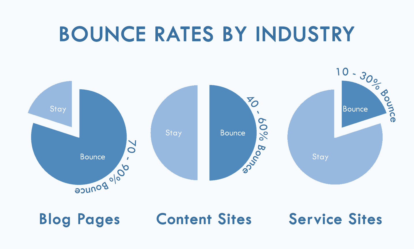
According to Optimizely, there are essentially 3 major elements to a “high-converting” landing page:
- Congruence — Landing page content should meet the expectations of the visitor (if they visited based on an ad, does the information on the page correlate with the content from the ad? Do the headlines match? Are the images the same or similar?)
- Trust — There should be a clear value proposition that promotes credibility. (Would someone buy from you based solely on the landing page content alone, even if they knew nothing else about your business?)
- Ease and simplicity — Your landing page should have a limited number of actions that someone can take (How much scrolling does the visitor need to do? Is there more than one CTA or button? How fast does the page load?)
Creating a landing page that is consistent with your branding message, trustworthy enough to elicit a buy-in, and easy enough to navigate isn’t always easy.
But it is necessary if you want your forms to convert.
Here are a few strategies to ensure that your opt-in landing pages sell the way they should:
1. Optimize Your Landing Page Headlines
A form is relatively easy to understand. You put your information in the fields that ask for them. Anyone can do it.
But that doesn’t mean that someone has a good reason to give you their information.
In fact, without a certain level of “sales” copy surrounding your forms, it may be harder to convert. Approximately 96% of visitors that come to your website are not ready to buy, so you need to give them a reason.
That starts with your headline.
As advertising legend David Ogilvy once said:
“On the average, five times as many people read the headline as read the body copy. When you have written your headline, you have spent eighty cents out of your dollar.”
People follow specific patterns when they read content. Studies from the Nielsen Norman Group and the Poynter Institute show that people read headlines first (most often in an “F” shape) more than the will ever read your text.
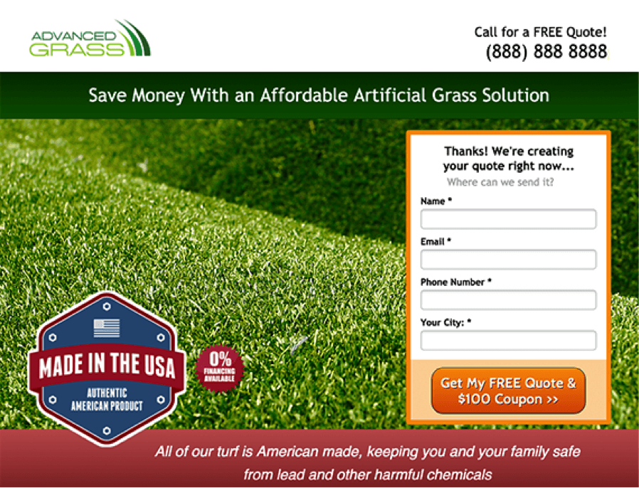
That’s why most landing pages or home pages look like this:
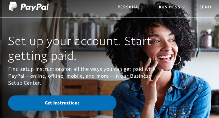
A bold headline, with some supporting text and a CTA. It’s simple. It’s understandable. And, studies show, it converts.
So what makes a good headline, exactly?
Studies show that things like headline type (questions vs. numbers vs. statements, for example), tone, and word count can all impact conversions differently.
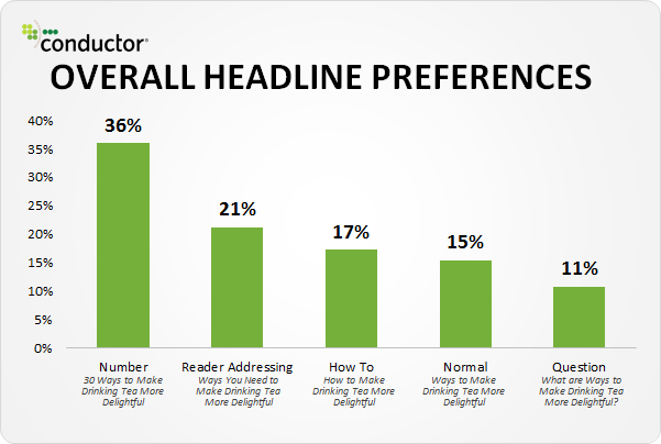
The key is to find headlines that work for your audience and move them through your sales funnel. This might mean creating several landing pages with different headlines to test relevancy and conversion rates.
To test your headlines, consider using a free tool like CoSchedule’s Headline Analyzer.
2. Personalize Your Form Questions
While you’re personalizing your headlines and landing page copy, you also have to personalize your form fields.
Some say, “Forms should be short, because short forms convert better. People don’t want to waste their time filling out long, complicated forms.”
This is true.
But it’s also true that people will fill out longer forms if it leads to content that’s tailored to their needs.
When one company switched from a one-step form (collecting only emails and names) to a longer, multi-step form that asked specific questions about project needs, they saw a 214% increase in conversion rates compared to their simple form.
Here’s part one of their form:
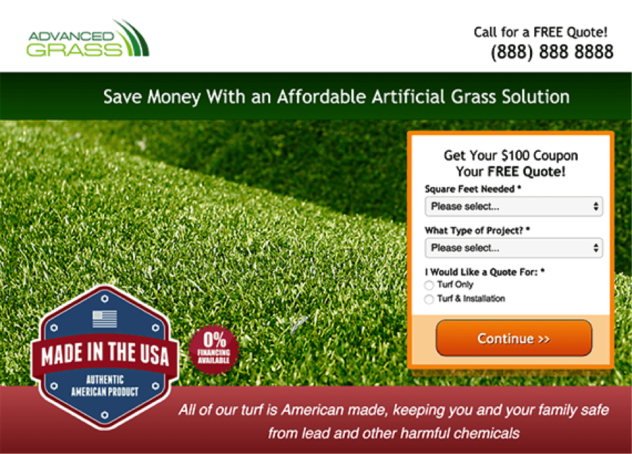
And part two:
It worked — even with added fields and steps — because site visitors could explain what they needed a quote for directly on the form, without having to wait for an email from a sales rep.
These are questions that sales reps would ask anyway, so you get more information from your forms without having to do extra work. It’s win-win.
In certain cases, adding more information to your forms can actually improve conversions, so don’t be afraid to play around with form types if you’re seeing a dip in conversions or a bump in bounce rates.
3. Use a Double Opt-In Landing Page
If you’re noticing that your forms aren’t converting, or that you’re getting high numbers of subscribers but low engagement, there’s another option you can try called the double opt-in.
A single opt-in looks something like this:

Someone gives their name and email and signs up for an offer. Once they’ve hit “Submit” they’re automatically subscribed to receive content.
The problem with this, however, is that people:
- Forget that they sign up for things
- Sign up for things to get a first-time offer and then never bother engaging again
- Sign up to get rid of your pop-ups but never plan on actually buying from you
- Sign up, buy once and then never repeat a purchase
This can cause a lot of problems with your conversion rates, because your email subscriptions or free trial sign ups may be growing without you seeing any actual revenue.
Double opt-ins work to correct this by asking someone to opt-in after they’ve already given their initial information, like so:
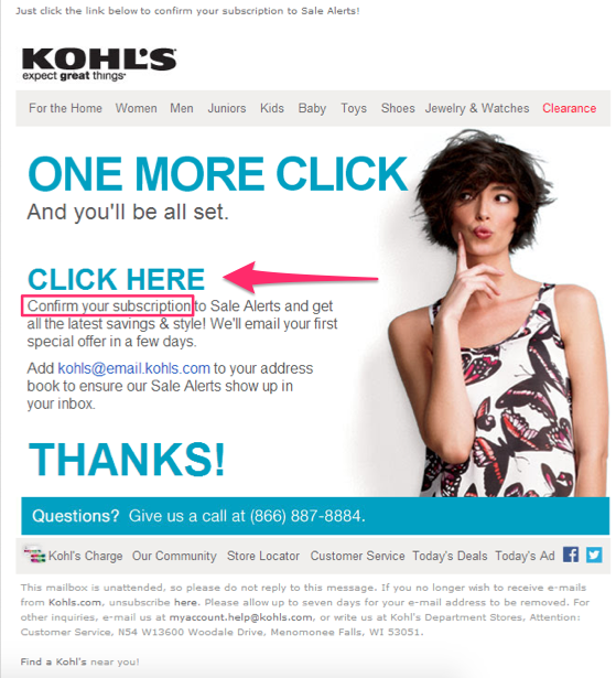
They have to confirm that they do, in fact, want your content or free offer or coupon.
Contrary to popular belief, most people don’t mind opting in a second time. It’s relatively easy for most users, and it can be a great way to increase the number of subscribers who will actually convert.
Double opt-ins also have an impact on your unique open rates:
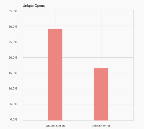
They have also been known to:
- Increase user engagement
- Remove spam or fake email addresses from your list (no wasted marketing money on spam accounts!)
- Improve the accuracy of your analytics (your bounce rates generally decrease, too)
So if you’re struggling to see your landing pages convert, even if you’ve spent time optimizing them, consider adding a double opt-in to your forms to make sure that subscribers are there for the right reasons.
This will help you gain a better perspective on what your audience really wants.
Final Thoughts
There are many ways to have a perfect landing page, but a couple of things are clear.
First, landing pages are essential to form conversions. A bad landing page can make or break your sales.
Second, landing pages need to be optimized to convert. This means creating catchy headlines that express information without overwhelming visitors, as well as simplifying them for ease of use.
Third, don’t get hung up on form length. Shorter forms do work, but in some cases, you may want to add fields that personalize your content. This not only saves time for the visitor, but also for your reps.
And finally, if one opt-in isn’t enough, try two. Having users subscribe again will not only help improve your conversion rates, but it will give your audience the content and the products that they actually want from you.
And a happy audience is a converting audience.