5 Form Problems That Cause Users Friction

Are you looking for ways to optimize your forms so they collect more submissions? A powerful way to boost conversions is to remove the frustrations your users deal with when they fill out your forms. These frustrations are called friction.
In this article, we’re going to explain friction, show you the top causes of form friction, and explain how you can eliminate these issues.
What is Friction?
Friction is any moment in the user experience that makes it difficult for a user to take an action. It’s a sticking point that slows down their journey or stops it entirely.
Friction can add up over time. Eventually, friction will become overwhelming, which causes the user to give up. In some cases, a single moment of friction maybe enough to convince the user to abandon the journey.
Friction is a broad marketing concept that applies to all of your users’ interactions with your brand. For instance, a user would experience friction if he wasn’t satisfied with the response from your customer support specialist. A user might also experience friction if he tried to use an expired coupon or if a web page loaded slowly.
Your forms are probably the most interactive elements on your website. This means they are prime locations for users to experience friction. You can take great strides in smoothing out your users’ experience by eliminating friction in your forms.
The following are the top causes of friction in online forms. Ask yourself if your users deal with any of these problems when they use your forms.
1. Users Don’t Know Their Progress
Imagine you’re filling out a form. At the bottom is a “next” button instead of “submit.” The button takes you to a new page with more fields. The first thing you’ll wonder is, “How many more pages are there?”
If users don’t have some kind of visual cue as to how much of the form is left, there’s a good chance they’ll assume it’s more than they want to bother with. It’s not fair to ask for their time when you don’t tell them (or show them) how much of it you expect.
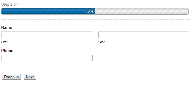
You can counter this by showing them their progress in the form so they know how far along they’ve come and how much is left. This can take many forms, like a progress bar that fills up a little more on each page, or a simple line of text that shows the current step out of the total steps. You can do both with Gravity Forms page breaks.

2. Users Don’t Understand Why You Need Their Data
We’re protective of our data these days. Countless data breaches have made us wary about who we give our personal information to, even if that information seems harmless (like our email address). So if you don’t give your users a compelling reason to part with their data, they may feel uncomfortable completing your forms.
Your job is to show a clear purpose for collecting the data points on your form. They understand why you need their name and email address, so you’ll have to make it clear that you have valid purposes for any other questions on your form.
For example, let’s say you want the user’s birthdate so you can wish them a happy birthday and send a free gift. It would help to explain your intentions before you ask for that data point, otherwise users might assume you’re asking for unnecessary information.
This doesn’t mean you have to make your form bloated with notes and instructions. All you need is some clever copy somewhere users will read before completing your form. For example, your form’s heading might say “Submit this form and receive a free birthday gift!”
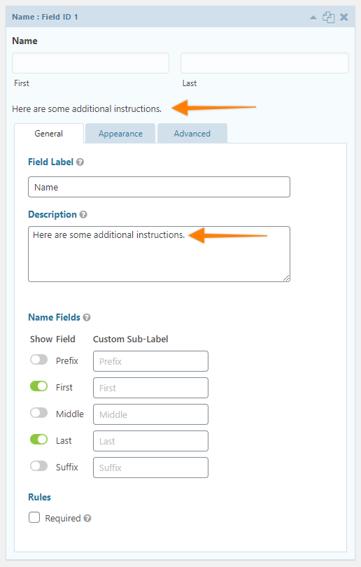
If you need to explain why you need a data point, Gravity Forms lets you add a description to each field. It appears above or below the inputs.

For a more subtle appearance, add tooltips each field. Read our tooltip documentation to learn how.
3. Users Can’t Pay with Their Preferred Method
If a user is ready to hand you money for your product or service, the last thing you want to do is disrupt their experience. At this point, your job is to clear every obstacle out of their way so they can complete their transaction by filling out your form.
When it comes time to open their wallets, people want to use their preferred payment option. Why? Because that’s the one they trust. They want to use the option they’ve used successfully in the past; the one that’s already linked to their finances.
(Could you imagine having to open a PayPal account just to make a purchase on a website? It would be faster to buy that product or service somewhere else.)
So whenever you set up a form with a payment function, make sure to give your users multiple options. This way they’ll always have access to a payment method they trust.
The Gravity Forms Elite License gives you access to the most popular payment services: 2Checkout, PayPal Payments Pro, and Stripe. You can also access Authorize.net, a powerful payment gateway that connects to almost any bank.
4. Users Can’t Find the Contact Form
One of the most common causes of friction is when users can’t find a contact form in the first place. They won’t search your entire website. If they spend too much time looking for the form – or fail to find it at all – they may assume one doesn’t exist.
This is especially true when users seek a contact form for a specific purpose. For instance, if a user can’t find a form to subscribe to your email list, he won’t make a request through your general contract form.
What’s the solution? Put your contact form in reasonable places across your website, like at the top of your home page, in your footer, in a pop up, or beneath your blog posts. If you aren’t sure where to embed your forms, check out our post on the best places to add contact forms on your site.
Most importantly, make sure to put your forms in the places people expect to find them. For instance, users would expect to find a form to submit a support ticket on your support page. They would expect to find a form to contact your marketing team on your media or press page.
5. Users Don’t Understand the Question
If a user doesn’t understand what you’re asking of them, you won’t just create friction in the user experience. You’ll stop the user experience all together! A user can’t possibly get through a contact or lead capture form if they don’t know how to answer your questions.
The biggest culprits here are vague input labels. For instance, labeling a field as “Business” may confuse users. Do you want the name of their business? Its type? Their industry?
Irrelevant input options are another issue here. If the user doesn’t feel that any of the options of a radio or dropdown field apply to them, they may assume the form – or your business – aren’t right for them as well.
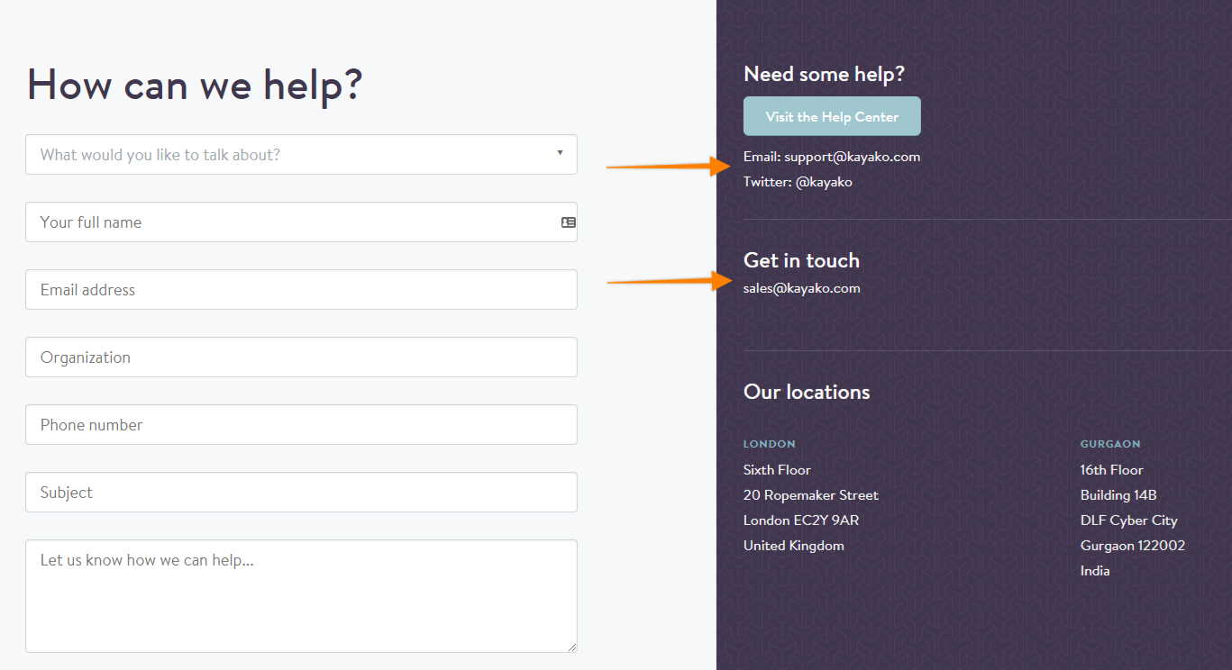
Review each question on your form for clarity. Ask someone impartial if all of your questions and options are clear for users. It also helps to include a phone number, email address, or live chat box on the page so users with questions can reach you.
Notice how this contact form has some alternative contact methods alongside it. This gives users more options to contact the brand if they don’t understand the form or can’t use it for some reason.

Minimize Friction No Matter How Small
Friction doesn’t just frustrate your users. It can diminish your conversions and ultimately your leads and sales. We’ve given you the most common causes of friction in the user experience, but your forms may have unique problems. Review your forms and ask yourself how you can make the user experience better. A small tweak to your forms can create a big boost for your business.

If you want to keep up-to-date with what’s happening on the blog sign up for the Gravity Forms newsletter!
