A Guide to Gravity Forms 2.5: Everything You Need to Know!
 With the latest version of Gravity Forms now live, we want to be sure everyone in our community is fully informed about the exciting new changes that this update brings. Gravity Forms 2.5 is one of the most important releases that we’ve ever seen, incorporating a number of impressive improvements and additions that we know you’re going to love!
With a beautiful, restyled form editor, intuitive drag-and-drop column control, and new markup and styles, 2.5 provides new ways of working, ensuring a streamlined and extremely user-friendly form building experience.
Importantly, 2.5 sees a key focus on accessibility, enabling you to be able to create totally accessible, WCAG 2.1 AA compliant, forms for your users.
In this Guide to 2.5 we cover the top features and functionality of Gravity Forms – what they are, what you can do with them, and why we’ve made the changes. These include:
- Accessibility
- The Form Editor
- Drag-and-Drop Column Control
- New and Improved Markup and Styles
- Other Features of 2.5
Importantly, we also discuss how to get your hands on 2.5, test your forms, and much more:
- Test Your Forms with the New Gravity Forms Markup
- Get Your Hands on Gravity Forms 2.5 Today!
- Sign Up for the Free 2.5 Demo
- Learn More About 2.5
Let’s dig in…
Accessibility
Ethically and legally, creating accessible forms is becoming more and more essential. 2.5 provides the tools you need to easily create accessible frontend forms for your users – helping you to engage with your audience and boost form submissions.
So whether you’re running a .gov or .org website, you’re in charge of an educational institution or non-profit organization, or you’ve got a small business or services site that you want to ensure is accessible to all, Gravity Forms 2.5 will help to make sure your forms are accessible to all your users.
Web Accessibility Explained
The World Wide Web Consortium (W3C) states “Web accessibility means that websites, tools, and technologies are designed and developed so that people with disabilities can use them”.
However, ‘disability’ doesn’t just refer to people with sight or hearing loss (which is often people’s first thoughts when it comes to web accessibility).
The mission of W3C is to “make the web available to all people, whatever their hardware, software, network infrastructure, native language, culture, geographical location, or physical or mental ability.’
By ensuring all websites are accessible to all, the internet becomes fair and inclusive, allowing everyone access to the content, information, and opportunities that the web provides.
Why Web Accessibility Matters
Accessibility is an important issue for many different reasons and on many levels. These include…
- An Ethical Standpoint – W3C is working towards a fair and inclusive web for all, whatever a person’s individual situation or needs. Full web accessibility ensures that everyone has the same opportunities and are treated as equals in any online situation – removing barriers that they may face in the physical world.
- A Business Argument – On average 20% of all traffic to your website will have issues accessing your content – if your site is inaccessible, that is a lot of potential customers that you have missed out on. Accessible websites also perform better across the board too. By using universal design strategies (strategies that ensure everyone can access your site) your website becomes more user friendly to all, not just those with disabilities, ultimately helping to boost conversions and revenue.
- Legal Compliance – Depending on your country and state, and where your audience is located, if your website isn’t fully accessible this could leave you open to lawsuits. You will find that laws on accessible websites differ greatly – for example, Government and public sector websites have to adhere to much stricter accessibility laws than some other industries. Therefore, it is crucial that you research accessibility laws and guidelines in your country and for your business sector to ensure that your site is complying with regulations.
For more information on web accessibility and why it matters, have a read of these articles from the blog –
- Web Accessibility: What Is It and Why Is It Important?
- Grow Your Business With Accessible Forms (The Business Argument for Accessibility)
Accessibility and Gravity Forms 2.5
W3C has produced Web Content Accessibility Guidelines (the most recent being WCAG 2.1) which are internationally recognized guidelines for improving web accessibility. Ensuring that the forms on your website are accessible is a must for any organization that is looking to adhere to these standards.
Gravity Forms is fully committed to accessibility and making the web accessible to everyone. This commitment is reflected in 2.5, which has seen our development team working with accessibility specialist, Rian Rietveld, and the team at Level Level, to ensure that with our form builder you will be able to create truly accessible forms.
You will find accessibility changes across the board to ensure our users can create forms that achieve WCAG 2.1 AA compliance. As you can see, 2.5 marks an exciting moment in Gravity Forms history, with this release solidifying our position as the most accessible form builder on the market.
The Form Editor
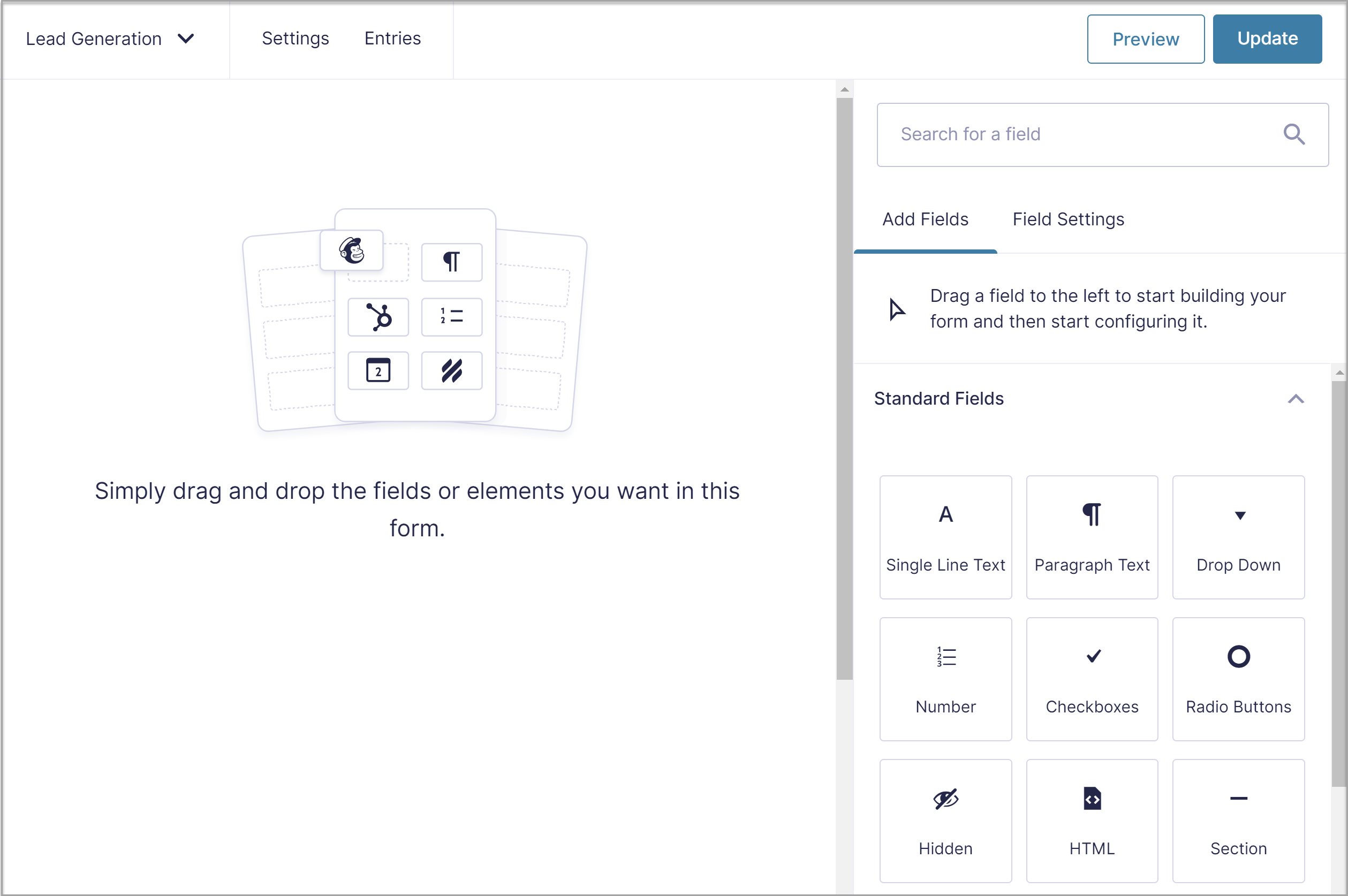 The new Gravity Forms editor has been restyled and reworked, making it easier to use than ever before. You will find new features, improved functionality, and an impressive user experience.
Here’s a sneak peek…
- New Look and Feel – The form editor has been given a new look… and it’s beautiful! Expect a complete redesign of the form building experience, with easy-edit field settings, re-designed settings pages, customizable form layouts, and much more.
- The WordPress Experience – The 2.5 form editor closely resembles the Gutenberg editor, providing a similar user experience to the native WordPress environment.
- Form Layout Control – With 2.5 you can easily manage your form layouts, enjoying drag-and-drop column control for up to four columns – no more CSS Ready Classes for columns needed!
Easy-Edit Field Settings
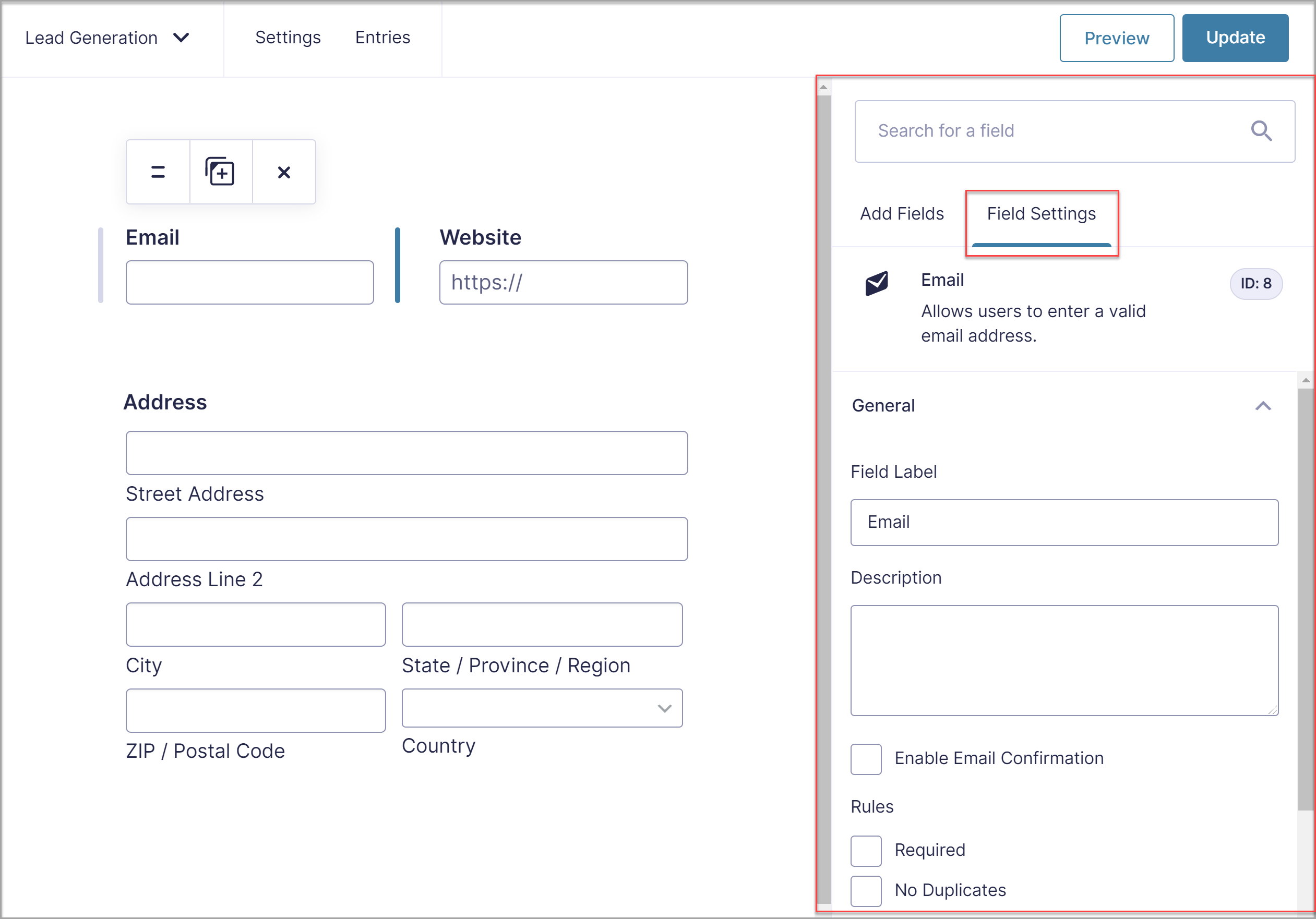 With 2.5, all field settings can be edited in an intuitive field settings menu bar on the right-hand side of the form editor. Watch your setting alterations play out in real time, helping you to make the right choices when it comes to editing the fields of your forms.
Fly-Out Conditional Logic Menu
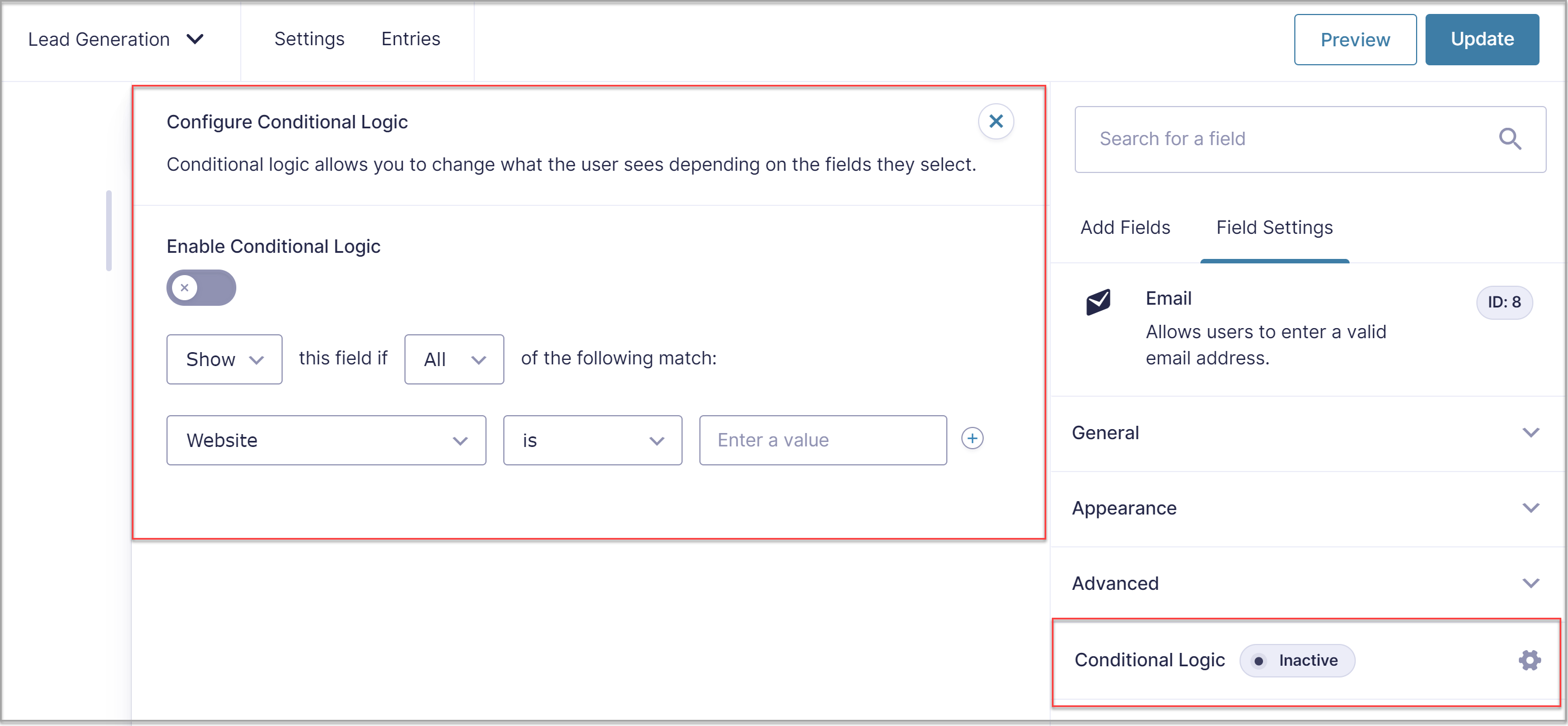 There have been many small tweaks added to the 2.5 form editor to enhance design, performance, and usability. One of these is an improved conditional logic UI, which includes a fly out menu to allow much more space for complex conditional logic sequences.
Redesigned Settings Pages
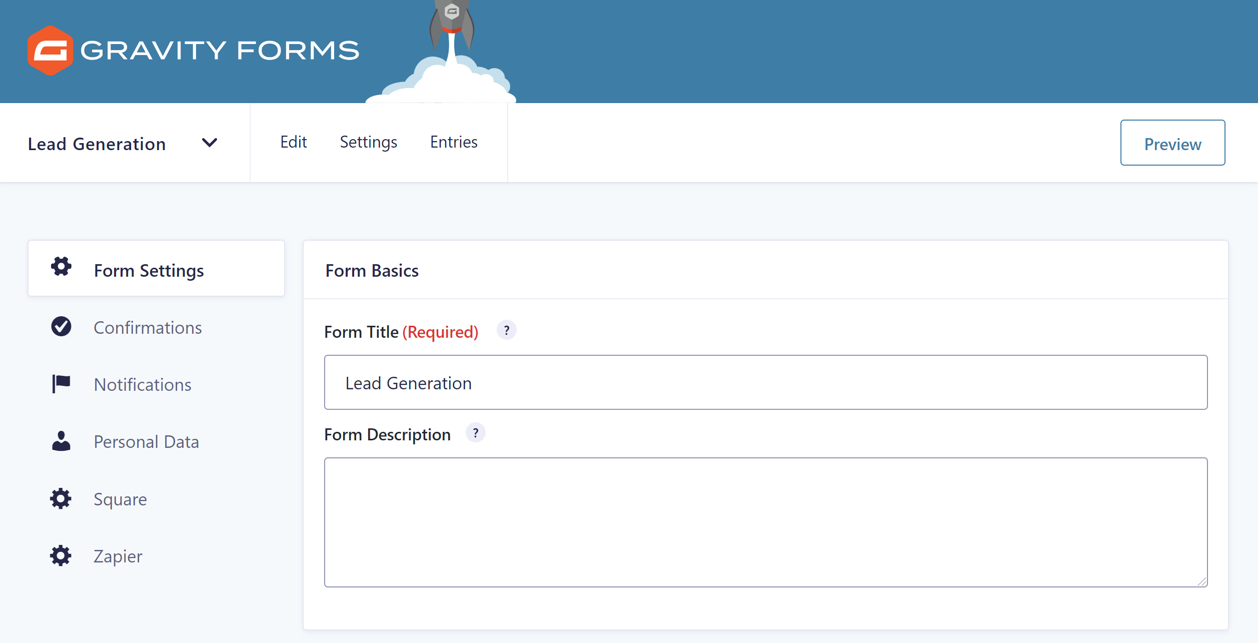 There has also been a complete redesign of the settings pages within the 2.5 form editor, giving them a fresh, modern look and feel, and a whole new and improved user experience.
For more information on the new form editor, check out this article from the blog – Take a Sneak Peek at the New Gravity Forms 2.5 Form Editor.
Drag-and-Drop Column Control
As mentioned, 2.5 introduces drag-and-drop column control so you can easily manage form layouts. Enjoy column control for up to four columns, enabling you to position form fields in the order and layout of your choice, and create unique forms to your exact requirements.
Create Multiple Columns
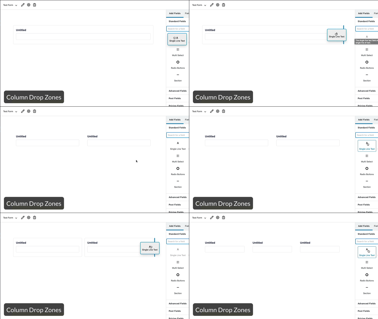 With 2.5 you can easily drag-and-drop fields onto the editor canvas, to the left or right of existing fields, to create columns.
Drag Existing Fields to Create Columns
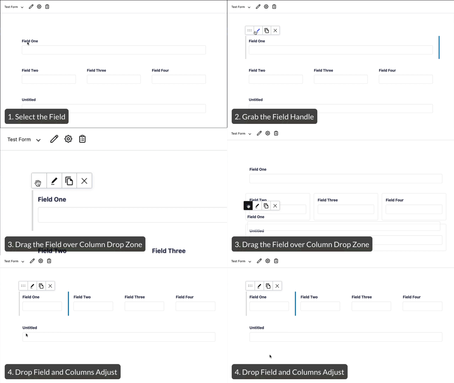 Within the editor canvas, you can drag existing columns into the ‘column drop zone’ – the editor will then automatically resize all fields within the dropzone to create columns of equal width.
Use Column Handles to Resize Columns
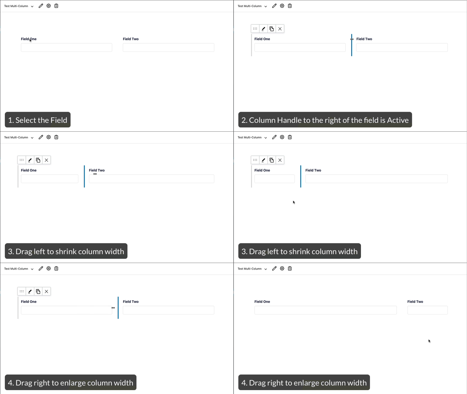 2.5 also allows you to adjust the width of each column by using the Column Handles to shrink or enlarge a field.
For more information on how to use 2.5 drag-and-drop column control, check out these articles from the docs…
New and Improved 2.5 Markup and Styles
As discussed, 2.5 sees a massive focus on accessible forms, as well as improved usability for our customers. This is reflected in the significant changes and improvement to the markup and styles that Gravity Forms uses.
Key points include…
- Markup – Changes have been made to modernize the markup, aimed at improving accessibility, extensibility, and usability. (It is important to note that all existing forms will default to Legacy Markup, meaning that new markup changes will not be in effect for those forms. However, new forms created in 2.5 will use the new markup and Legacy Markup can be disabled or enabled for any form in the Form Settings).
- Form Styles – The CSS styles have been rewritten to make it much easier for our developer and designer communities to customize front-end forms.
- Scripts – With 2.5, all scripts (including inline scripts) will now be deferred and loaded in the footer by default. This means you should see an improvement in content loading times, providing an all-round better experience for your users.
For more information on changes to Gravity Forms markup and styles, as well as examples of what you can expect with 2.5, have a read of these articles from the docs…
Other Features of 2.5
As well as extensive improvements to accessibility, the form editor, and form markup and styles, 2.5 also has a selection of other impressive features that are worth a mention. Let’s take a look…
- New Settings API – To help make settings easier to render on any page, not just an add-on page.
- Added Security Enhancements – Security has always been, and will continue to be, a top priority for Gravity Forms. This is reflected in the security enhancements added in 2.5.
- Conditional Logic – Pages hidden via conditional logic no longer appear in the page navigation which alleviates end-user confusion.
For more information on 2.5, check out the Gravity Forms 2.5 Resource Hub.
How to Test Your Forms with the New Markup
As mentioned, 2.5 sees major changes to Gravity Forms markup – if you choose to enable this new markup, there is a possibility that it could affect your existing forms.
Due to backwards compatibility, changes will not affect existing forms – by default existing forms will use the same markup they’ve always used (called Legacy Markup). But, if you want to benefit from the new markup, which will help you to easily customize frontend forms, as well as improve form accessibility, then we advise that you test your existing forms first in a sandbox environment.
This will give you an opportunity to play around with 2.5, review your forms, and deal with any compatibility issues if they arise.
To test an existing form with the new markup, simply navigate to its Form Settings page, scroll down to Form Options, and disable Legacy Markup.
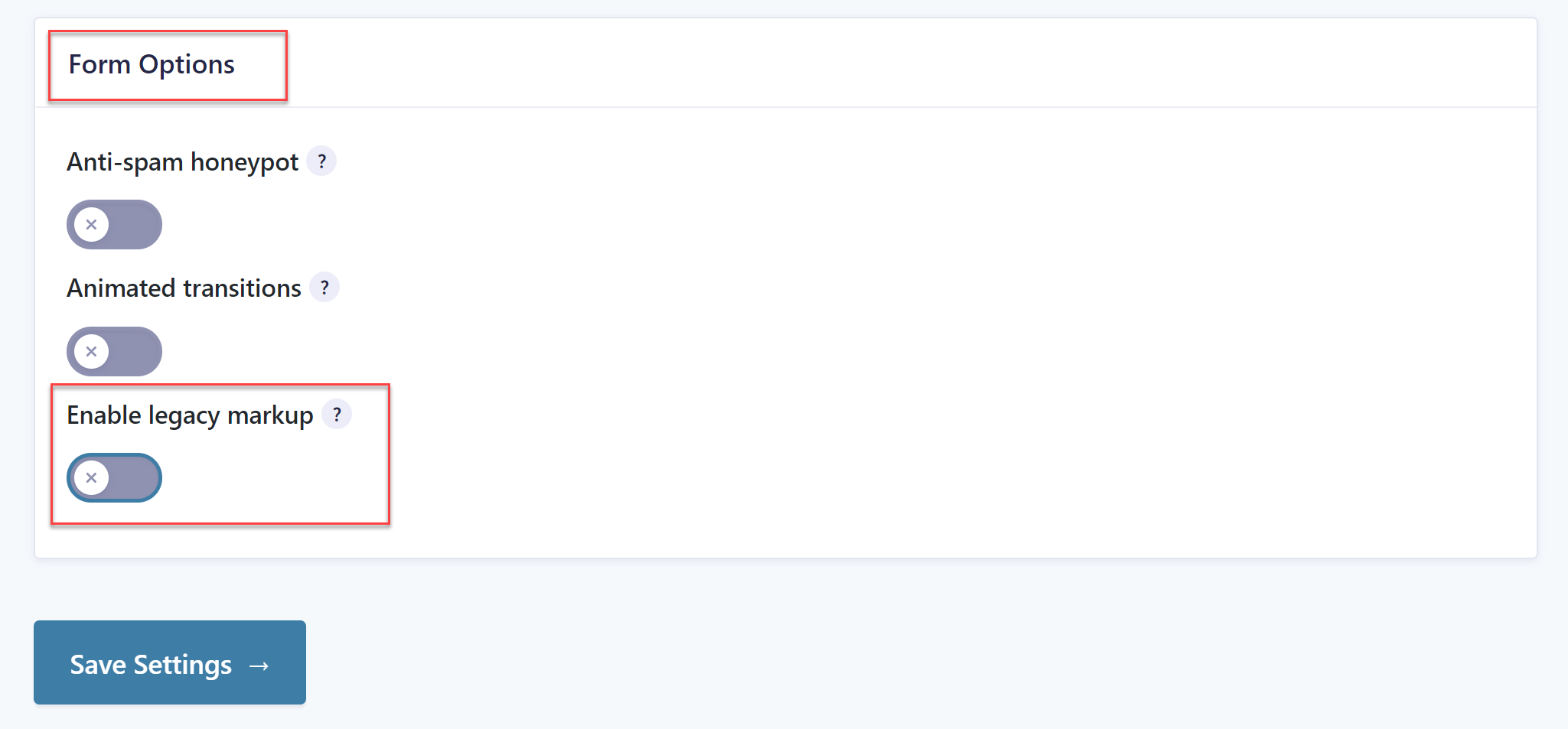 Any new forms you create with 2.5 will default to the new markup, although you can enable legacy markup at any time.
Again, testing affords the opportunity to create forms using the new markup and get comfortable with the new ways of working, all within a safe environment.
Gravity Forms 2.5 is Now Available!
Gravity Forms 2.5 was launched on 27th April, 2021. But as it is a major update we are launching it via a staggered rollout, to ensure the smooth adoption of this release. This means that if you have an active Gravity Forms license, you’ll receive the 2.5 update through your WordPress admin at some point during the forthcoming rollout period.
However, if you don’t want to wait, Gravity Forms 2.5 is also available to all our customers to download from your Gravity Forms account dashboard.
To summarize:
- Gravity Forms 2.5 Update in WordPress Admin – All customers can expect to receive an update during the rollout period (commencing 27th April, 2021). You will need to manually update the plugin within your WordPress Admin.
- Download 2.5 from Your Gravity Forms Account Dashboard – All existing customers can now download 2.5 from your GF Dashboard.
- New Customers – Gravity Forms 2.5 is now available to buy. Check out our pricing page to find the plan that best suits your requirements.
If you have any questions about Gravity Forms 2.5, or the staggered release procedure, please contact Support.
Sign Up for the Free 2.5 Demo
We know that some people maybe cautious about committing to such a big update, which is why we have created a 2.5 demo experience.
Once you’ve signed up, you’ll have your own personal 2.5 sandbox, where you can install themes, plugins, and add-ons, as well as import your existing forms, enabling you to immerse yourself in the 2.5 experience, as well as giving you the ability to test everything 2.5 in a safe environment.
Here’s what you need to know about the 2.5 demo…
- Free to Use – Our 2.5 demo is free to use and last for 7 days – simply input your email address to get logged in.
- Test Your Forms – Easily import your forms and test them with the new Gravity Forms markup (more information on how to do this below).
- Test with Your Themes and Plugins – Within the demo you can upload your choice of themes and plugins to test with 2.5.
Learn More About 2.5
Want to find out more about 2.5 to ensure you get the most out of this update? Then check out these resources…
- 2.5 Resource Hub – Watch the 2.5 video, access further materials, and immerse yourself in the 2.5 experience!
- Gravity Forms 2.5 Demo – Want to check out 2.5 for yourself? Try out the 2.5 demo and immerse yourself in the whole 2.5 experience.
- Gravity Forms Documentation – Our docs site is packed full of extensive resources and tutorials, helping you to get the most out of your Gravity Forms license.
Join Our 2.5 Mailing List
Make sure you sign up to our Gravity Forms 2.5 mailing list to stay updated with all the latest 2.5 news and announcements….
