After Submit: What Happens After the Form?

You spent a lot of time, energy, and money getting visitors to your website and convincing them to complete one of your forms. But what happens after they click the submit button?
You have to give them closure. They need to know that they submitted the form properly. You may also need to give them additional information or further steps to follow.
In this article, we’re going to lay out post-submission options you can implement to ensure users have a healthy experience.
3 Post-Submission Actions
There are three actions that can take place after a user submits a form: a confirmation message, a page redirect, and a notification email.
1. Confirmation Message
A confirmation message is a simple message that appears on the user’s screen near the form to give the user basic information. The purpose is to notify the user that the form was submitted properly. It can also be used to impart simple information.
Here are some examples of common confirmation messages:
- “Thanks for contacting us! A salesperson will contact you within 48 hours.”
- “Thanks for signing up. Check your email for your next steps.”
- “Your submission was received. See you at the event!”
The key to writing a great confirmation message is to keep things simple. This is not the place to write long explanations or give complex instructions. If you need to write more than two sentences, consider redirecting the user to another page rather than using a confirmation message.
If you have to give instructions in your confirmation message, limit yourself to a single sentence. If you give multiple steps, there’s a good chance your users won’t follow them properly. If they leave the form’s page, they’ll have no way of re-enabling the confirmation message to re-read the steps.
In Gravity Forms, you can edit a form’s confirmation by clicking the Confirmations tab in the form’s settings. Choose “text” under Confirmation Type and write your message in the text field.
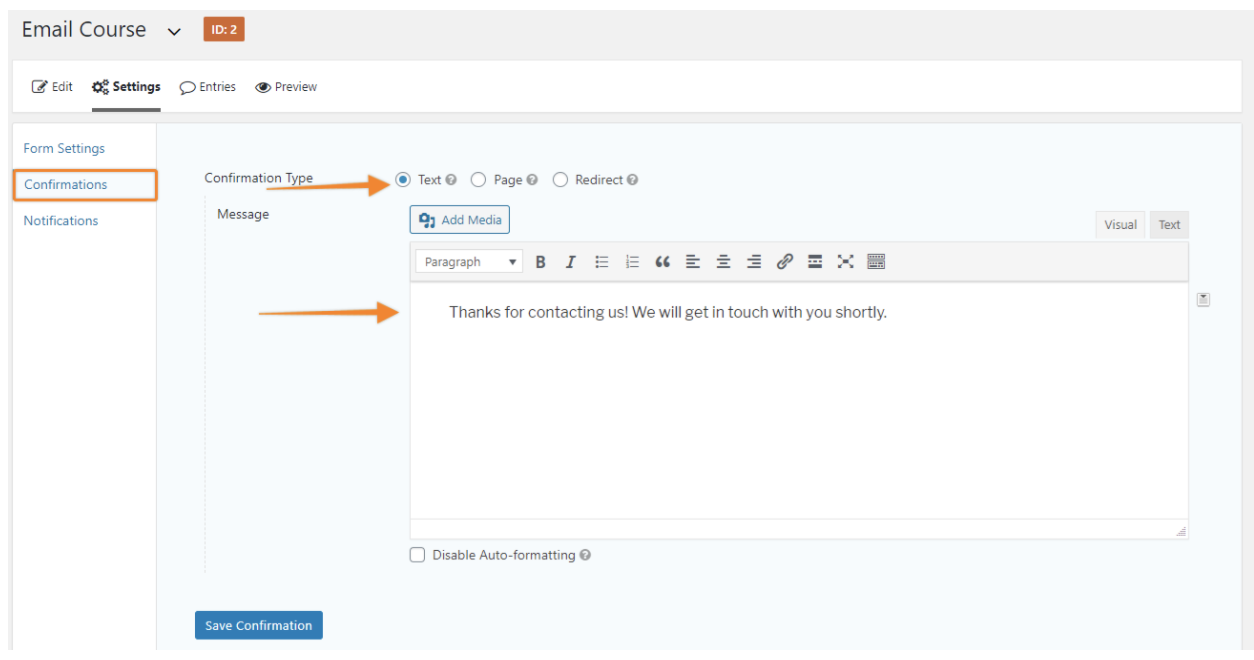
We supply a default message, but you can use the WYSIWYG editor to write anything you like. You can even add HTML and images to customize the message to your needs. For instance, you might include the profile picture of the salesman who will return their message.
2. Redirect Page
If you have a lot of information to give the user, consider redirecting them to a new page. This is commonly referred to as a “thank you page” because the first words on the page typically thank the user.
Unlike your confirmation message, your redirect page isn’t just a place to confirm the submission. This page is an opportunity to delight the user, add value, and encourage them to take additional actions with your business. You might ask them to…
- Whitelist your email address.
- Read your best-performing blog content.
- Follow your social media channels.
- Tell you more about themselves.
- Convert their free trial into a fade subscription.
- Use a coupon or discount.
- Share your offer with their friends.
- Buy a one-off product.
- Anything else that matters to your business!
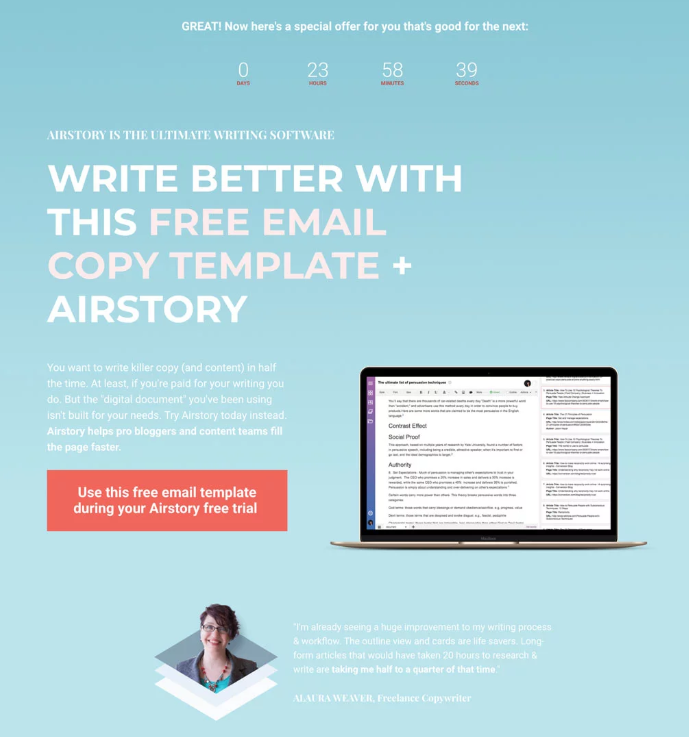
Take a look at this redirect page from Copyhackers. It quickly confirms the user’s submission then moves them on to something new – a free gift! They give a free email template to entice you to sign up for a free trial of another product.
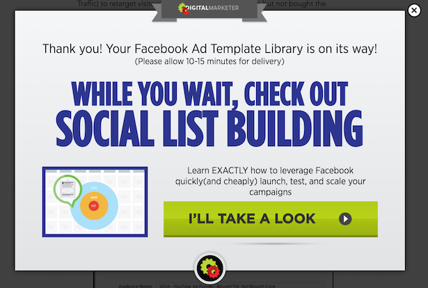
Digital Marketer has a simple and effective redirect page as well. They notify the user that their free content is on the way, then encourage them to take a look at a similar piece of content.
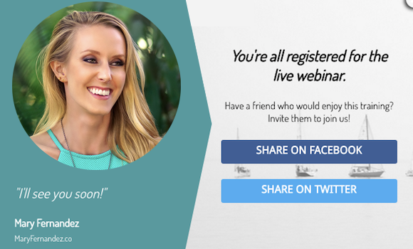
After registering for a Mary Fernandez webinar, she asks you to share it with your friends so they can join too. She gives you the opportunity to brag with a click of a button!
In Gravity Forms, you can select a redirect page by clicking the Confirmations tab in the form’s settings. Choose “Page” or “Redirect” next to Confirmation Type.
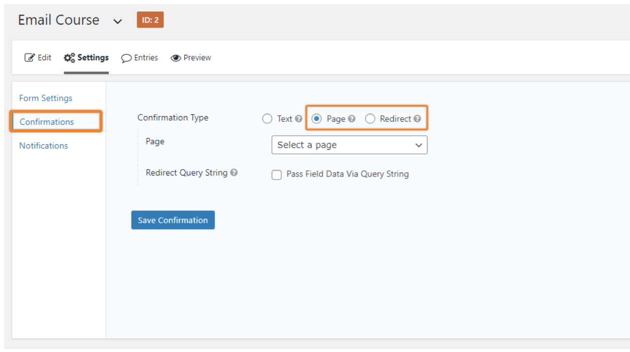
The “Page option” displays a drop down menu where you can choose one of your existing WordPress pages. Use this option if the page is part of your WordPress site. If you ever change the URL of that page, this redirect will still work.
The “Redirect” option displays a simple text field where you can input any URL. Use this option if you want to redirect the user to another website.
3. Email Notifications
No form would be complete with one or more email notifications! These are pre-arranged emails sent from your WordPress backend upon a successful form submission. You can set them to send to the user, yourself, or anyone you wish.
Email is a personal way of communicating with your customers and subscribers. They are more likely to read the email than a confirmation message or even a thank you page. So if there’s critical information you absolutely need them to know, include it in an automated email.
Furthermore, email notifications are great ways to establish an email-based conversation in the user’s inbox. They grow accustomed to opening and reading your emails. They also signal to their email client that your address is safe.
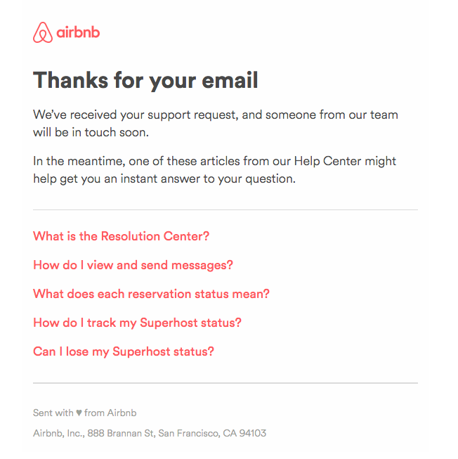
An email notification is also a great tool to help the customer solve their own problems or find more value in their experience. For example, check out this AirBnB email. They let you know when someone will get back to you and offer some helpful articles that may solve your problem.
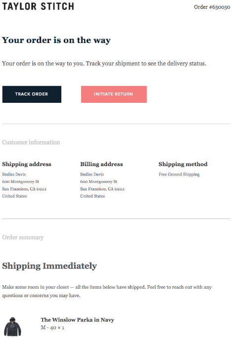
If you sell products through your form, you’ll definitely want to use the email notification to serve as a receipt. This Taylor Stitch does a great job confirming the purchase, giving the buyer a record of important information, and giving the buyer the opportunity to take additional steps like track the order or return it.
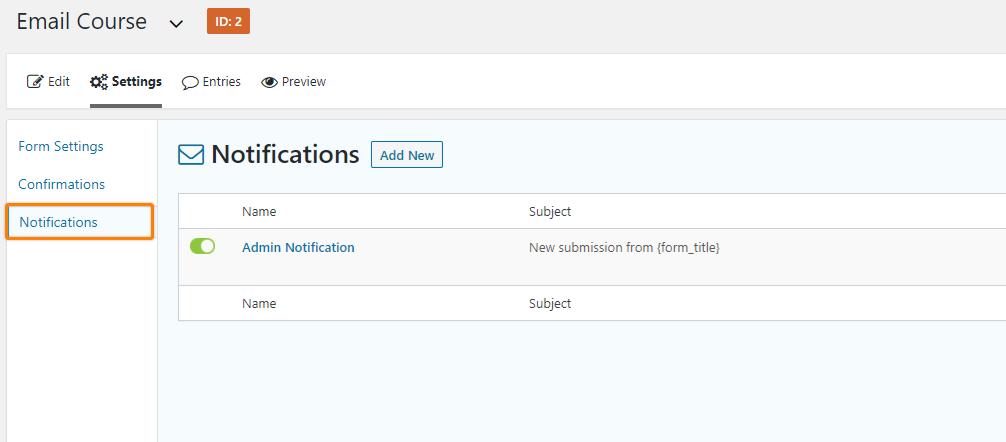
In Gravity Forms, you can create email notifications by clicking the Notifications tab in the form’s settings. The default Admin Notification is an email sent to WordPress administrator’s address. It contains the information of all the fields for each submission. We recommend keeping this. Click Add New to make a new notification.
The next screen lets you create a new notification. Start by giving it a Name. The user doesn’t see the notification’s name. It’s just to help you distinguish between notifications.
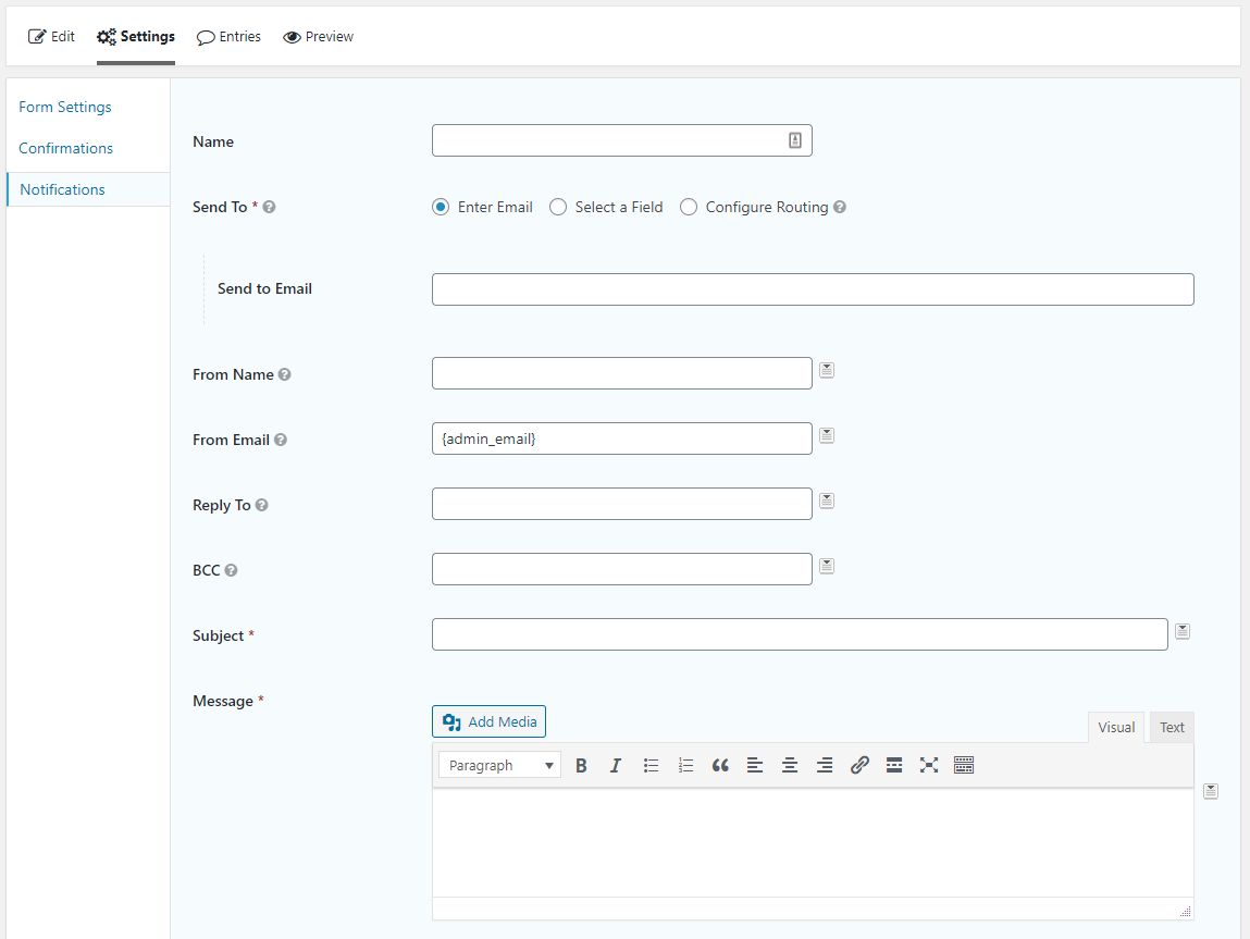
Follow these steps to complete the remaining fields of the notification email:
- Send To: Select “Select a Field” and choose the form’s email field. This designates the recipient of the email.
- From Name: Put the name of person/brand who the email is from.
- Subject: Create a subject line for this email.
- Message: This is where you’ll input your message to the recipient. Use the drop down selector to the right of the message block to insert merge tags (dynamic snippets that get replaced by values from the form).
Which Post-Submission Action is Right for You?
The post-submission action you choose for your form depends on the nature of your business and the type of information you need your users to know. While we can’t tell you which actions are right for your type of business, we can give you some guidelines.
Generally speaking, you don’t need both the confirmation message and the redirect. Most marketers use one or the other. If you simply want the user to know that you received their submission, a confirmation message is usually sufficient.
For example, a lawyer who collects leads on his site probably doesn’t need to give users more than a “Thank you for contacting us. We’ll reach out to you within 24 hours.” There’s not much more the lawyer can do until they know more about the cient and the case, so it’s best to just thank the submitter and reach out to them later.
But a membership course creator may have a lot to say! He might want to give instructions for accessing his course, offer an affiliate code for members to give out, and ask for social media shares. That’s far too much for an on-form confirmation message.
We recommend that every marketer send a notification email to the submitter. There’s simply no downside. What you put in that email, however, will depend on the form and your business needs.
Key Takeaway
Just because you have their email address doesn’t mean your work is done. Create closure for submitters by displaying an on-screen confirmation, redirecting them to a thank you page, and sending a notification email. This will create a complete, positive user experience.

If you want to keep up-to-date with what’s happening on the blog sign up for the Gravity Forms newsletter!
