Conversational Forms vs Paginated Forms: A Comparison
When you first start using Gravity Forms, you might find yourself asking the question, what’s the difference of conversational vs paginated forms? That’s understandable, as they are based on similar principles and both are available for use in Gravity Forms.
To help make things clearer, in this article we explain what conversational and paginated forms are, their differences, and the use cases they are most suitable for. Follow along, and you’ll be a pro on this topic in no time.
Conversational vs Paginated Forms – What’s the Difference?
As a first step, let’s define the two subjects of this post: what exactly are conversational and paginated forms, and how do they differ from each other?
Conversational Forms: A Step-by-Step Experience
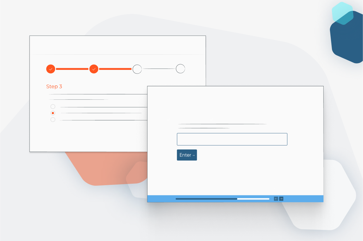
Conversational forms derive their name from the way they work. In this form type, you see form fields on the page by themselves and go through them one by one. For example, if you are building a survey form, it would ask you each question in a separate screen.
This creates a back-and-forth dynamic that is similar to having a conversation—hence the name. For a first-hand experience, we have a gallery of examples for different types of conversational forms.
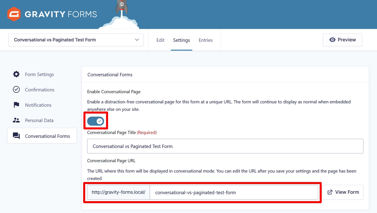
To use conversational forms in Gravity Forms, you need the Conversational Forms Add-On. Once installed and activated, you can switch the conversational format on in any of your forms’ settings, even a payment form. All you have to do is flip a switch and define the URL under which you want the form to be available.
At the same time, you can build the forms in the usual way, there is no need to learn a new interface. Furthermore, they work with almost all other Gravity Forms features you know and love, like conditional logic, payment add-ons, and more.
The add-on also has many styling options for your conversational forms that we will cover in detail below.
The Conversational Forms Add-On is available for holders of the Elite and Nonprofit License. If that’s currently not you, you can also try it with a free demo site.
Paginated Forms: The Tried-and-True Classic
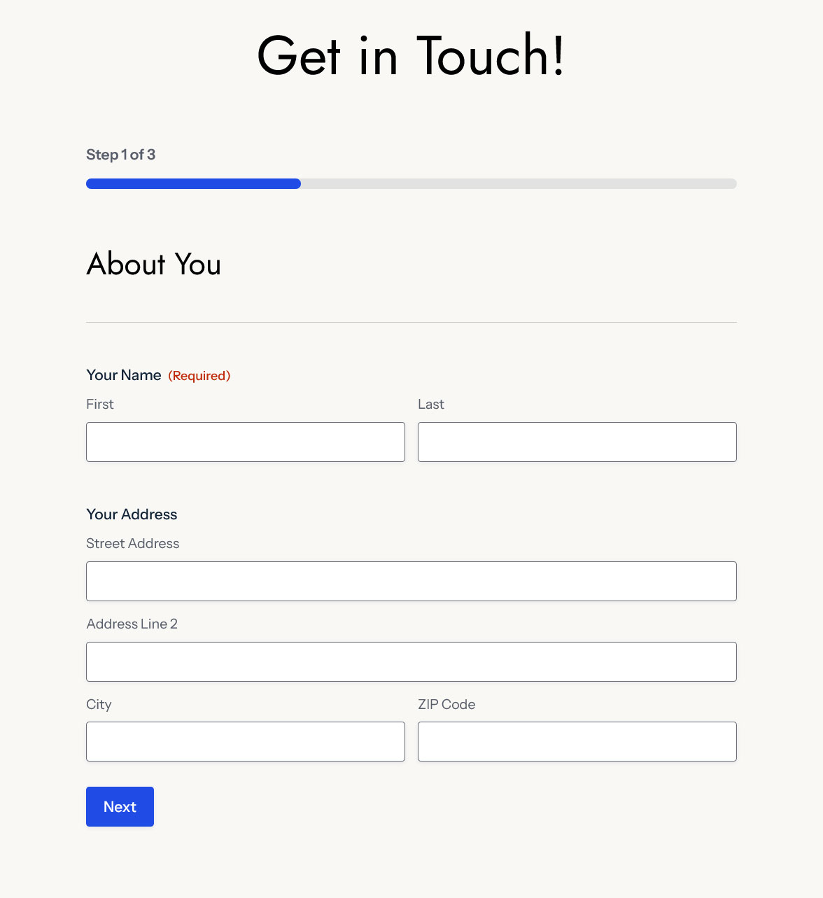
Paginated forms work similarly to conversational forms in that they display forms in chunks instead of all at once.
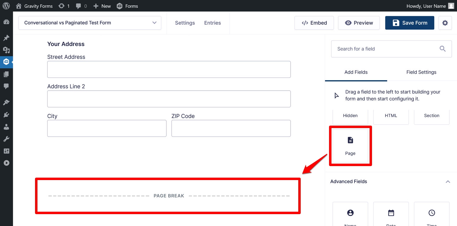
The difference is that, in this case, you can control where the form splits. You do this using the Page field. Simply input it into your form where you want the cut-off to happen, and Gravity Forms does the rest when the form appears on your website.
Unlike conversational forms, there are very few styling options. On the other hand, paginated forms are available on all Gravity Forms licenses as the Page field is among the standard form fields.
Important Features of Conversational Forms
With the definitions out of the way, it’s time to have a look at what each type of form has to offer.
Good for User Engagement
The main draw of conversational forms is that they make the process of filling out forms more exciting and engaging:
- Users take a more active role in navigating the form
- There are fewer distractions since it’s a full-screen form and users deal with one section at a time
- You have the possibility to add more information and branding elements
All of this can help boost conversions. Conversational forms are also more mobile-friendly because there is less on the screen, making them easier to use with touch.
Plenty of Styling Options
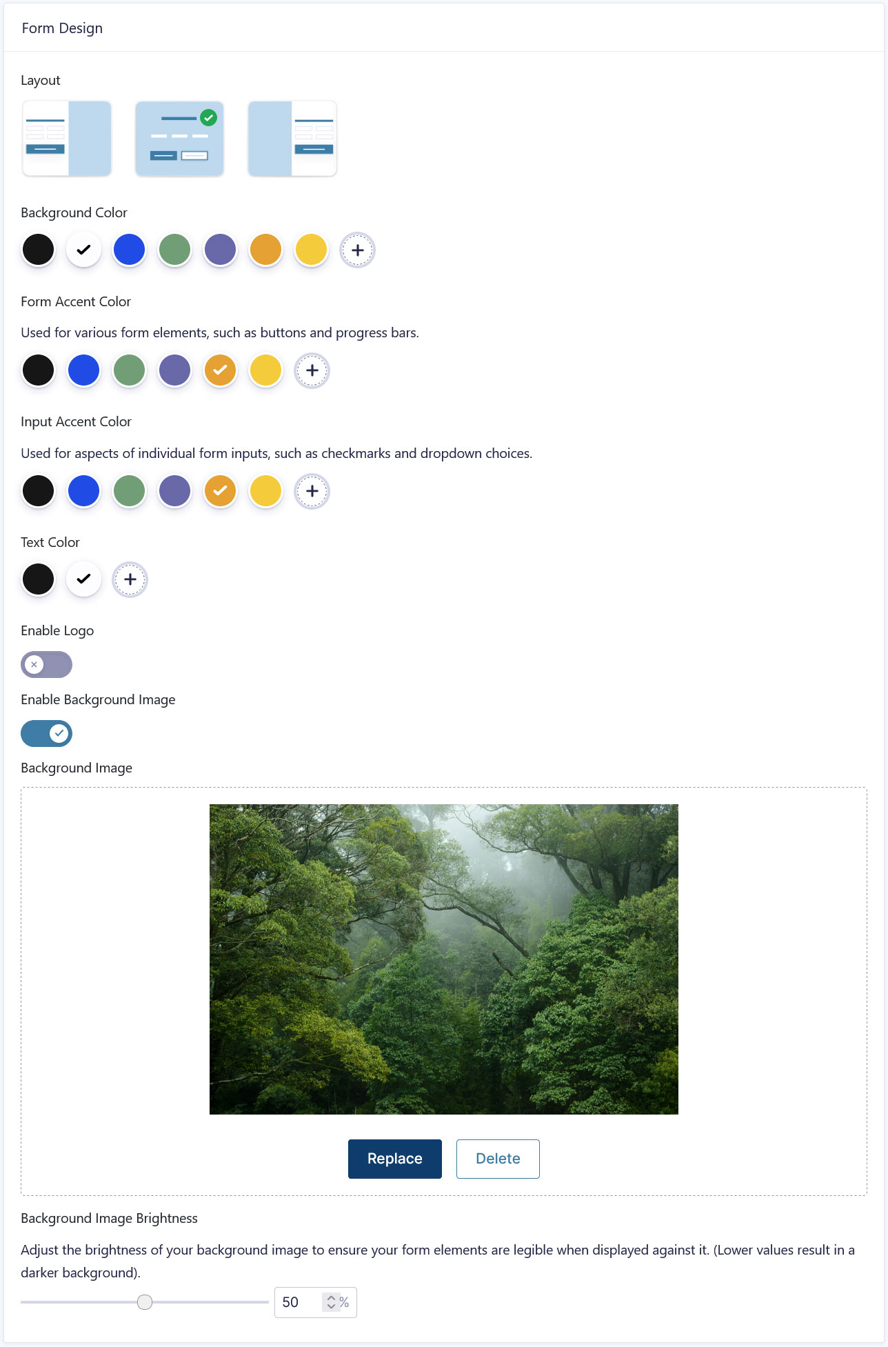
Another big plus that conversational forms offer vs paginated forms is that they give you a lot of design options. This means it’s easy to make them match your website and branding. Here are just a few things you can customize in the Conversational Forms Add-On:
- Alignment of your form fields (left, right, center)
- Background color, logo, and background image
- Colors for text, buttons, form inputs, and more
- Form footer colors and customizable progress bar
All of that happens in a user friendly interface that requires absolutely no coding knowledge, so even beginners can create interactive forms with ease!
In general, because of their linear interactivity, conversational forms offer opportunities to reinforce your brand, messaging, and tell a story. They also look sleek and modern out of the box.
Not Embeddable
At the same time, something you have to keep in mind is that a conversational form is a separate entity. It lives on its own page and only there. You cannot embed it in a different post or page on your website.
That is, you still have the ability to embed your forms as usual; they just won’t be in the conversational format. So, if that is your goal, then it might be best to opt for a traditional, paginated form.
Only Available on the Elite and Nonprofit License
Another thing to pay attention to is that, as mentioned, the Conversational Forms Add-On is only available on the Gravity Forms Elite and Nonprofit Licenses. If you didn’t purchase either of these, and don’t want to upgrade your license (you’ll only pay the difference), this option unfortunately doesn’t exist for you.
What You Get With Paginated Forms
Next, let’s talk about what paginated forms have to offer.
Great for Longer Forms
The main purpose of pagination is to make very long forms more user-friendly. Paginated forms allow you to cut them down into several pages and group information together however it makes sense.
This makes forms more organized, less overwhelming, and confronts users with less information at a time. Basically, paginated forms offer all the same the same benefits as conversational forms minus the styling options.
Yet another difference is that paginated forms give you full control over where the division happens. The fields in conversational forms appear in the order that you add them in the editor from top to bottom. The pagination feature, on the other hand, allows you to decide where the breaks happen yourself.
This allows you to organize the information however you want.
Quick Setup
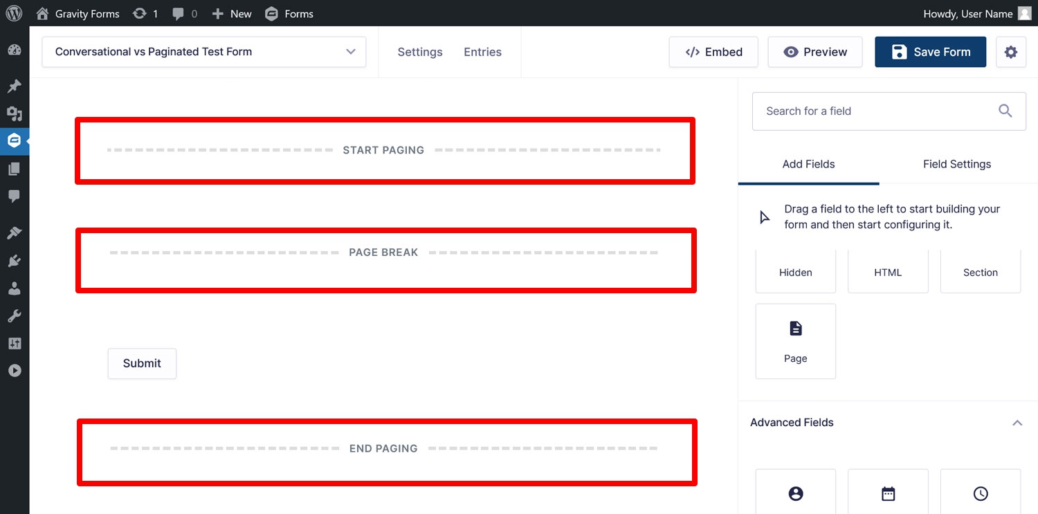
In addition to the above, setting up pagination in your forms is incredibly quick. All you have to do is input the Page field at each place where you want to divide your form.
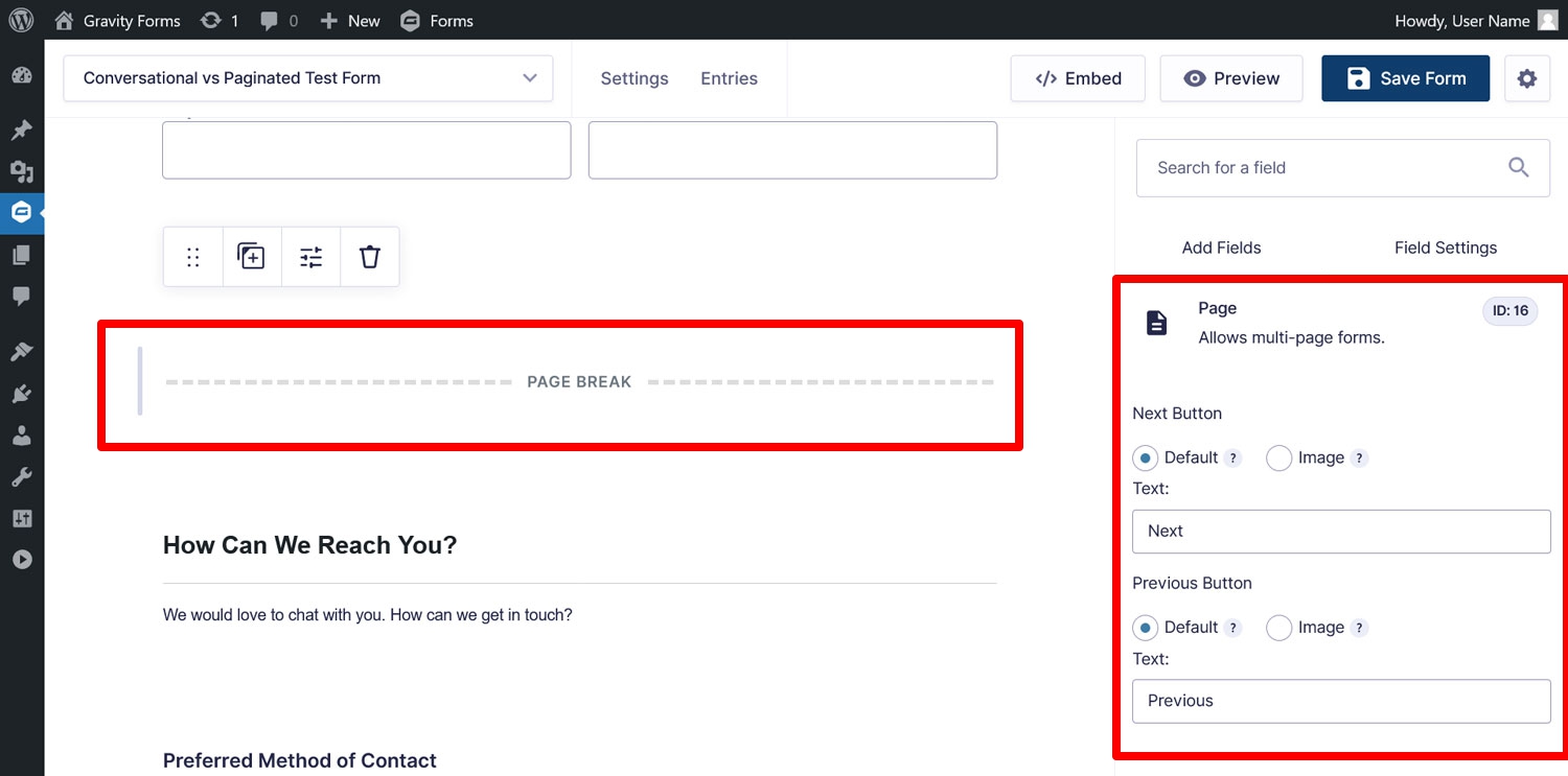
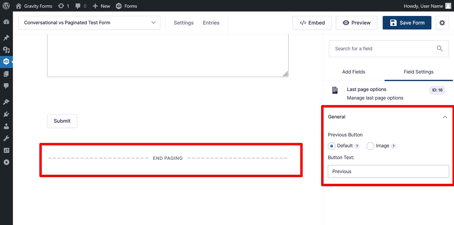
Doing so automatically creates three elements: Start Paging at the beginning of the form, Page Break where you place the Page field(s), and End Paging at the form end.
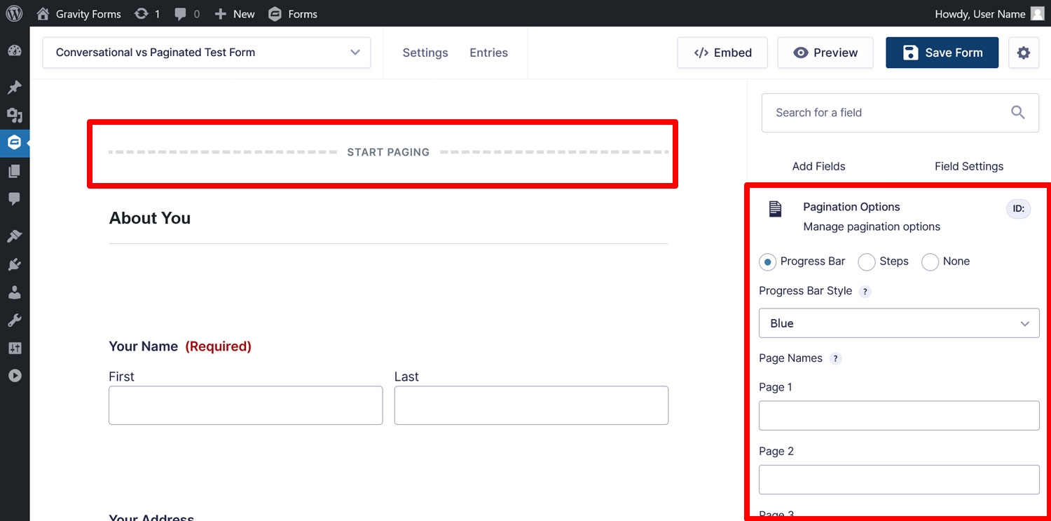
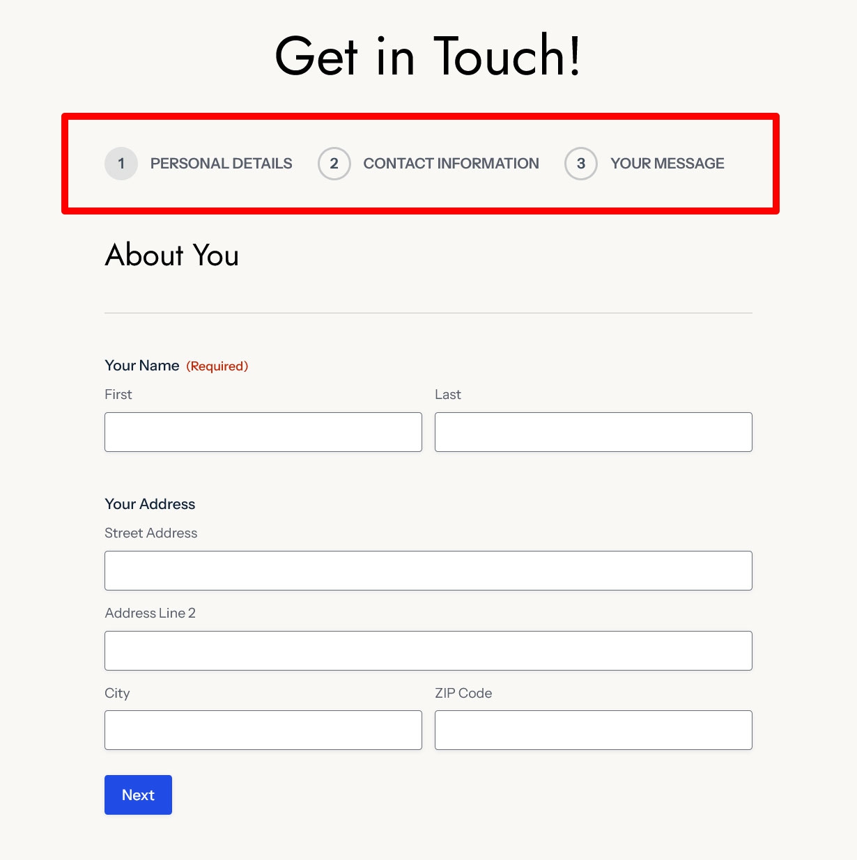
Each of these offer some sensible customization options. When you click on Start Paging, you can make changes to the progress indicator that automatically shows up in paginated forms.
If you use a progress bar, you can decide what color it should be as well define names for the individual pages. Should you use steps as your progress indicator, you can provide names for those as well.
It is also possible to switch off the indicator completely.
In the Page Break fields, you can customize the text for the “next” and “previous” buttons or replace them with images of your choice.
They also let you use conditional logic to hide specific pages or the “next” button depending on user choices.
Finally, End Paging contains styling options for the “previous” button of the last form page.
By default, paginated forms don’t require as much fiddling as conversational forms to ensure they fit the rest of your site. You can simply embed them usual, and the styling simply comes from your WordPress theme or any form styling you apply.
Universally Available
The final advantage of paginated forms is that they are available to all Gravity Forms users. Whatever license you own, the Page field is always available and can be input into any form you build. It also allows you to test the advantages of conversational forms in a more limited scope.
Conversational vs Paginated Forms: When to Use Which
Conversational and paginated forms both make your forms less overwhelming and more engaging. So, when should you use which type?
Go for conversational forms if you:
- Want to provide your users with a bespoke and interactive experience
- Would like your form to include your branding, logo, and other images or visual elements
- Don’t need to embed your form among other post or page elements
- Have the right license for it
On the other hand, paginated forms are for you if you:
- Simply want to break down a long form into smaller chunks
- Need an embeddable form
- Want control over how form information is grouped
- Are satisfied with your lower-tier license
Choosing the right type depends on your specific needs. By understanding these differences, you can make an informed decision on which form style best suits you.
And if this has peaked your interest in conversational forms, consider upgrading your license, making a Gravity Forms Elite license purchase, or simply test driving them on a free demo site.

If you want to keep up-to-date with what’s happening on the blog sign up for the Gravity Forms newsletter!
