Setting Clear Expectations with Your Lead Generation and Contact Forms

“What happens next?” is a common question users ask before they complete a form. They don’t know exactly what will happen after clicking the submit button. Their uncertainty often prevents them from clicking it at all.
A key way to boost conversions (throughout all of your marketing, not just your forms) is to set clear expectations for your customers. You can help them make a decision to move forward by explaining what will happen next.
In this article, we’re going to show you some important ways to set expectations for your users and customers. These simple techniques will make them feel comfortable about taking the next step with your brand (and all of them are easily managed in Gravity Forms).
How to Set Expectations for Form Users
In order to set expectations, you have to inform users what will happen as they interact with your brand. You can do this by using clear language, providing timelines, and serving information on your thank you page and in your follow-up email.
1. Use Clear Language
A great way to make your users and customers comfortable with your website (and your entire online presence) is to lay out what happens after they take action. They should always have a good idea what will happen before they click a link, read a page, or submit a form.
For instance, let’s say you publish an ad on Facebook for people to read your new eBook. You include a call to action that says “Learn More.” People expect to learn more about your eBook after clicking your link. But if your link sends them to a payment form, their expectations won’t match what’s in front of them. They’ll bounce off your site right away because they weren’t expecting to make a purchase.
Explain what will happen before your users submit one of your contact forms or lead generation forms. Be absolutely clear with your language and imagery. Don’t get lost in trendy marketing speak. Avoid phrases such as…
- “Join our revolution.”
- “Are you ready to take the plunge?”
- “Create a better you.”
That type of phrasing seems powerful, but doesn’t explain what will actually happen. Instead, opt for simple language, such as…
- “Request a 100% free quote.”
- “Join our community of volunteers.”
- “Get your free diet plan.”
That type of language helps users understand exactly what will happen once they take the next step. Your form title is a great place for this. You can also reinforce their expectations by using specific language in the call to action. Avoid using vague words like “Submit” or “Complete.”
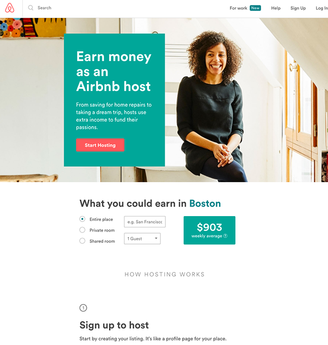
This AirBnB landing page uses language well. The title and call to action are simple and straightforward.
2. Give a Reasonable Timeline
Timelines make users and customers feel comfortable that things are working behind the scenes. It reassures them that you’re taking steps to fulfil your end of the bargain, even though they can’t see it. So whenever you tell them what happens next, give some kind of indication about when it will happen.
Shipping estimates are the simplest form of a timeline. You probably depend on these yourself. If you sell a physical product, it’s important to tell your customers when they’ll receive it. Even better: Give them a link to track their package so they can follow it every step of the way.
Timelines are useful if you provide a service, as well. Let your customers know when they can expect you to deliver the service. For instance, if you sell landscaping services, you might tell leads how long before someone reaches out to them by phone or how long until someone stops by to review the property.
Whenever you set a timeline, make sure you can meet it. Don’t give overly optimistic dates just because you think that’s what the customer wants to hear. It’s better to under promise and over deliver. If you fail to meet your estimate, your users and customers will immediately assume the worst. You’ll end up reassuring them by email or over the phone, which defeats the entire purpose of the timeline.
3. Redirect to a New Page
The landing page where users submit your form isn’t the only place you should set expectations. You should also help your users understand what happens next with a dedicated “thank you” page.
The thank you page is the perfect opportunity to explain the next steps and timeline in full detail. You already have the conversion at this point, so don’t worry about being long-winded. In fact, details and specifics will reassure users that there’s a clear process moving forward.
If you need the submitter to do anything on their end, the thank you page is the perfect time to give those instructions. For instance, you might need them to whitelist your email address, collect some data, or be prepared to answer certain questions for an upcoming phone call.
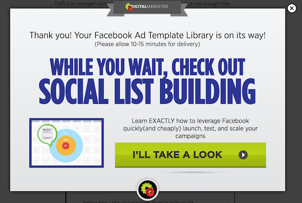
Your thank you page is also an opportunity to prompt the user to make more interactions with your brand. This Digital Marketer page may be succinct, but it does the job well. It thanks the user, tells them their product is on the way (what’s next), tells them when they’ll receive it (timeline), and then urges the user to grab an additional product.
In Gravity Forms, you can redirect users to any page after a form submission. They will only reach the page if the form is submitted successfully.
4. Send an Email Receipt/Notification
Once a customer uses a form, it’s important to send an email notification right away, even if you already sent them to a thank you page. This serves a few purposes:
- It verifies that the user gave you a legitimate email address. If the email is undeliverable, you know the user gave you a bogus address, probably to get your freebie.
- It established an email-based relationship. The user grows accustomed to interacting with emails from you and your brand. This makes them more likely to open your emails in the future.
- It provides them with necessary information about the form submission, like a receipt for a purchase, the date of their submission, and any other information you think they should be able to access at any time without returning to your site.
Point #3 is how you set clear expectations. This is another place to show them your timeline or what happens next. Make sure to include anything your users might need to know or use to have a better interaction with your brand. That might include…
- Payment information, such as how much they paid for each product/service, the manner they paid (last four digits of their credit card, for example), or when the transaction will appear at their bank.
Shipping information, such as their shipping address, estimated delivery time, and a link to track their order. - Links to access restricted or downloadable content.
- Information to get the best use out of your product, such as how-to guides, explainer videos, or instruction manuals (or links to any of those).
- Instructions to return the product or receive a refund.
- Links to content you’ve created that helps them get more value out of your product or service.
Answers to common questions. - Some extra information about you or your brand to make them more comfortable.
You don’t have to include all of that in the email confirmation, of course, just the tidbits that soothe any potential anxiety about your brand. For instance, if you know recent customers still struggle with lingering doubts about hiring you to manage their social media profiles, you could include a link to a case study that shows how you helped a customer grow their social media presence.
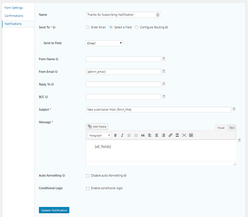
In Gravity Forms, you can customize your email notifications to give your submitters all the information they need.
Make Users Comfortable
To many people, submitting a form is a big step, especially if it leads to another big step like arranging a call, getting a quote, or making a purchase. This decision is often fraught with anxiety. As a marketer, your job is to make your users and customers comfortable by setting expectations for the experience.

If you want to keep up-to-date with what’s happening on the blog sign up for the Gravity Forms newsletter!
