Have You Installed Gravity Forms 2.5 Yet? Here’s why you should…
 Earlier this month we released Gravity Forms 2.5, and we have already seen this latest version of our form builder installed on hundreds of thousands of WordPress sites. We have been delighted by the response of the Gravity Forms community to 2.5, and we are now calling on all our customers to install this update if you are still yet to do so!
With a beautiful redesigned form editor UI, the introduction of drag-and-drop column control, and a shift to accessible forms, Gravity Forms 2.5 is packed full of new features and intuitive ways of working. But don’t just take my word for it!
In this article, we talk to some of the Gravity Forms team, who share their favorite 2.5 features, improvements, and changes, giving you more insight into what this latest version of our plugin can do for your forms.
Let’s jump straight in…
The Refined Interface Makes the Form Editor More Enjoyable to Use
 Jeremy Ward (Software Engineer, Product Team)
“For me, I think the refined interface is the star of the show. Our team has done a lot of work to refresh the UI and hopefully make it more enjoyable to use. We’ve redesigned some aspects of the user interface in a very small way to, in some cases, reduce the number of steps our customers need to take to create and manage their forms, and to make better use of the screen real-estate. I think the new conditional flyout component in the form editor is a great example of this, because we realized just how small the area was when working with those rules in the sidebar panel, so we developed that flyout panel to provide more space for managing those complex rulesets.
Another example of UI refinement is the incorporation of search into a few different areas of the form editor, making it easier for form creators to find and switch between existing forms and to search for a field instead of clicking through the panels. I think it’s really handy and I use it myself all the time when developing new features for the product.
Finally, I think the icon sets we’ve added are wonderful, as well. It’s nice having some additional imagery to go along with the text when managing all of the forms, and I think it helps greatly with navigation.”
New Markup Makes It Easy to Customize Forms
 Morgan Kay (Software Engineer, Product Team)
“GF 2.5 makes it so much easier for front-end developers to customize the look of forms. The new markup is much simpler and more logical, so it’s a lot easier to write custom CSS for forms. Being able to drag and drop fields into columns also makes layouts a lot easier.”
Accessibility is really important, but it’s not always easy to convince clients to spend the extra money to pay for making a website fully accessible. Now it doesn’t take any more time or effort to make forms fully accessible.”
Create Forms Faster with Drag-and-Drop Column Control

Alex Cancado (COO / Founder)
“Every now and then someone in my family will ask me to set up a website for them and I will end up installing and configuring Gravity Forms as a user. Every single time, I find myself spending a lot of time rearranging fields into columns using the ready classes, and that takes away from the form building experience. It is a cumbersome process and it takes time.
So my favorite 2.5 feature is the ability to create columns and resize them right in the form editor. For me as a user, it makes form building way faster and more pleasant.”
Everything Feels More Intuitive

Mark Quaranta (Director of Marketing)
“I’m sure like a lot of folks, I’ve been really excited about the redesigned UI, especially when it comes to actually building forms. While I was familiar working with the old design, everything now feels even more intuitive.
The field settings are where I’d expect them to be. Drag and drop column control works just like you think it should. And the Conditional Logic slide out is the cherry on top. It all makes form building much easier, quicker, and honestly more fun.”
An Awesome Visual From Building Experience

AJ Morris (Product Manager)
“I love the new form builder. The ability to add form fields in rows and control where the submit button goes in a visual way is awesome.”
Quick Navigation Within the Form Editor

Michelle Bauer (QA Analyst, Product Team)
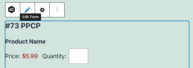
“While we spent so much time working on the form editor itself, one of my favorite new features is the ability to jump straight to the form editor or the form settings for a form directly from the form block. This saves me time and frustration by not having to navigate through the menus!”

Easy to Embed Forms

Aaron Speer (Software Engineer, Product Team)
“Despite my general cautioning that I am, in fact, still Jenny from the Block, my site editors continually found themselves confused by the Blocks that I got with Gravity Forms 2.4. With the new 2.5 Block, things are much clearer and embedding forms is as easy as restarting my romantic relationship with Ben Affleck.”
2.5 Resources: Find Out More!
Like the sounds of 2.5? Want to find out more to ensure you get the most out of this update? Then check out these resources…
- 2.5 Resource Hub – Watch the 2.5 video, access further materials, and immerse yourself in the 2.5 experience.
- Gravity Forms Documentation – For indepth info on 2.5, check out our extensive docs site.
- Gravity Forms 2.5 Demo – Want to check out 2.5 before you update or buy? Try out the free 2.5 demo.
Gravity Forms 2.5 is now available to all new and existing customers. Simply install the update from within your WordPress Admin, or download it from your Gravity Forms account dashboard.
As always, our helpful and knowledgeable Support team are on stand by if you have any questions about this update.
New customer? Head on over to our pricing page to choose the right Gravity Forms license for your form building needs.

If you want to keep up-to-date with what’s happening on the blog sign up for the Gravity Forms newsletter!
