How to Get More Signups from Your Newsletter Signup Forms
Written by the Editorial team at Omnisend…
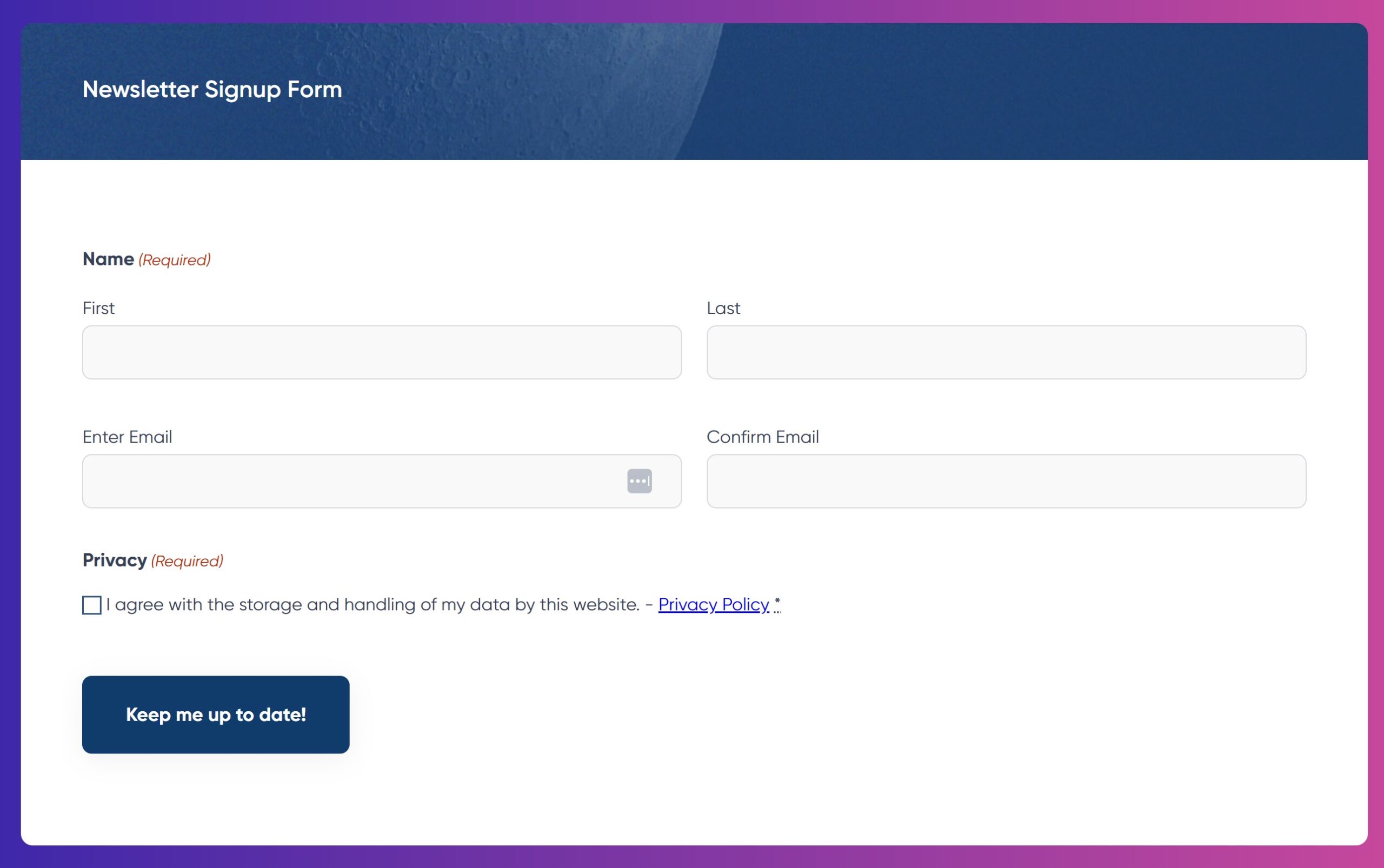
When it comes to growing your audience and nurturing leads, a newsletter signup form is a go-to tool for many marketers. However, not all signup forms are created equal.
A signup to a newsletter should grab the visitor’s attention and require just enough effort to fill it out, so as to not overwhelm them. That means you have to think about the placement and timing, as well as the design, copy, and overall flow of your form.
In this article, we’ll share tips on how to create more engaging signup forms, so your newsletter list grows quicker, filling up with quality leads! We’ll discuss timing and placement, multi-step approach, and gamification.
Timing and Placement: Where and When to Show Your Signup Form
The timing and placement of your newsletter signup form can have a major impact on conversion rates. Forms that are either intrusive or too hidden won’t get you the signups you’re after. So here are some tips, to help you choose wisely:
Here are the best places to include a newsletter signup form:
1. Homepage: Your homepage is often the first touchpoint a visitor has with your website. Including a signup form there, particularly in the hero section, ensures it gets noticed.
Pro tip: Don’t overwhelm visitors immediately. Instead, include a subtle call-to-action (CTA) that appears after some scrolling. You can use a banner or embedded form that doesn’t interrupt the user experience.
2. Blog section or after blog posts: Visitors reading your blog are already engaging with your content. Adding a form at the end of a blog post is natural, especially when paired with a compelling message, like, “Stay updated on our latest insights.”
3. Sidebar: Sidebars offer a great non-intrusive option to feature a signup form on every page of your site. This approach is subtle, yet consistently visible as users browse your content.
4. Popups: Love them or hate them, popups can be very effective if used properly. The key is to avoid being too aggressive. Set your popup to appear after a user spends a certain amount of time on your site or scrolls a specific percentage of the page.
5. Exit-intent popups: These popups appear when a user is about to leave the website. Since they’ve already engaged with your content, this is the perfect time to prompt them with a signup offer. Exit-intent popups don’t interrupt the user experience but can still capture leads before they leave.
Multi-Step Forms: A Smoother Signup Process
One of the biggest reasons people abandon forms is because they are overwhelmed by the amount of information requested upfront. Multi-step forms help solve this problem, because psychologically, people are more likely to commit to a task if they are presented with smaller steps rather than one large hurdle. By spreading your form fields over several steps, users are less likely to feel overwhelmed and more likely to complete the form.
Breaking Your Form Into Steps
1. Start simple: In the first step, ask for the most basic information, such as their email address or first name. This lowers the barrier to entry and gets users invested in completing the form.
2. Gather additional info later: On the next step, you can ask for additional details such as location, preferences, or areas of interest. If a user has already completed the first step, they’ll feel more committed to finishing the signup process.
3. Use a progress bar: Including a progress bar at the top of the form helps guide the user through the process and shows them how close they are to completing the form. This reduces frustration and abandonment rates.
Optimizing Multi-Step Forms
To ensure your multi-step form converts, keep these best practices in mind:
- Minimize fields: Only ask for essential information. Unnecessary fields will reduce your form’s completion rate.
- Use conditional logic: Smart forms that adapt based on the user’s previous responses improve user experience. For example, if a user indicates interest in a certain product, you can customize subsequent questions.
- Keep it mobile-friendly: Ensure that your multi-step form is responsive and easy to use on mobile devices.
Gamification and Incentives: Make Signing Up Fun
Gamification taps into a user’s desire for fun, challenge, and rewards. This approach uses game-like elements to encourage participation. And when it comes to signup forms, you can incorporate these elements to create a sense of excitement around joining your newsletter.
Types of Gamified Forms
1. Quizzes and surveys: Quizzes can be a fun way to engage users while collecting valuable information. For example, create a personality quiz related to your product or service, with the promise that they’ll get their results if they sign up for the newsletter.
2. Giveaways: Giveaways are an effective way to incentivize newsletter signups. Users provide their email address in exchange for entry into a contest or raffle. The prize doesn’t have to be extravagant; sometimes a free product or discount code can be enough to entice visitors.
Best Practices for Gamification
While gamification can boost signups, there are a few guidelines to follow to ensure the experience remains positive:
- Stay relevant: Make sure your incentives or games are relevant to your audience and your business. Offering an iPad giveaway might attract signups, but it won’t necessarily attract the right kind of leads.
- Keep it simple: Don’t complicate the process. The game or incentive should enhance the signup process, not make it longer or harder.
- Create a sense of urgency: Limited-time offers or countdown timers can push users to sign up now rather than later.
Collect Leads with Gravity Forms and Omnisend
If you’re running a website on WordPress then you need a secure and flexible form plugin that you can trust. With Gravity Forms you can create beatiful and stylish forms, specific to your business needs. Gravity Forms comes with a wide assortment of built in features and an ecosystem of add-ons. From a intutitive drag and drop form editor, to conditional logic, multipage layouts, and expert support, Gravity Forms will support you at every stage of your form building and lead generation journey.
Once you’ve created and optimized your forms to get more newsletter signups, it’s important to ensure that you’re making the most out of these new leads. Choosing the right email marketing platform can be a game-changer when it comes to nurturing and converting your subscribers into loyal customers.
Platforms like Omnisend are designed to help you automate your email campaigns, segment your audience, and track performance, all in one place. With powerful tools like pre-built automations, A/B testing, and detailed reporting, Omnisend ensures you can create highly personalized, targeted emails that drive engagement and conversions.
How to Get Started with Gravity Forms and Omnisend
Using the Omnisend for Gravity Forms Add-On allows you to easily send the emails collected from your Gravity Forms signup forms directly to your Omnisend audience lists.
Below is a quick walkthrough on how to create a newsletter signup form that syncs with Omnisend. To follow along with this tutorial you will need:
- Gravity Form installed and activated on your WordPress website.
- An Omnisend Account.
- Newsletters, Email Marketing, SMS and Popups by Omnisend installed on your WordPress site and connected to your Omnisend account.
- Omnisend for Gravity Forms Add-On installed on WordPress.
Once you have the above installed, activated and connected, creating high-converting forms is a straightforward process…
Step 1. Go to Gravity Forms → New Form → Add New.
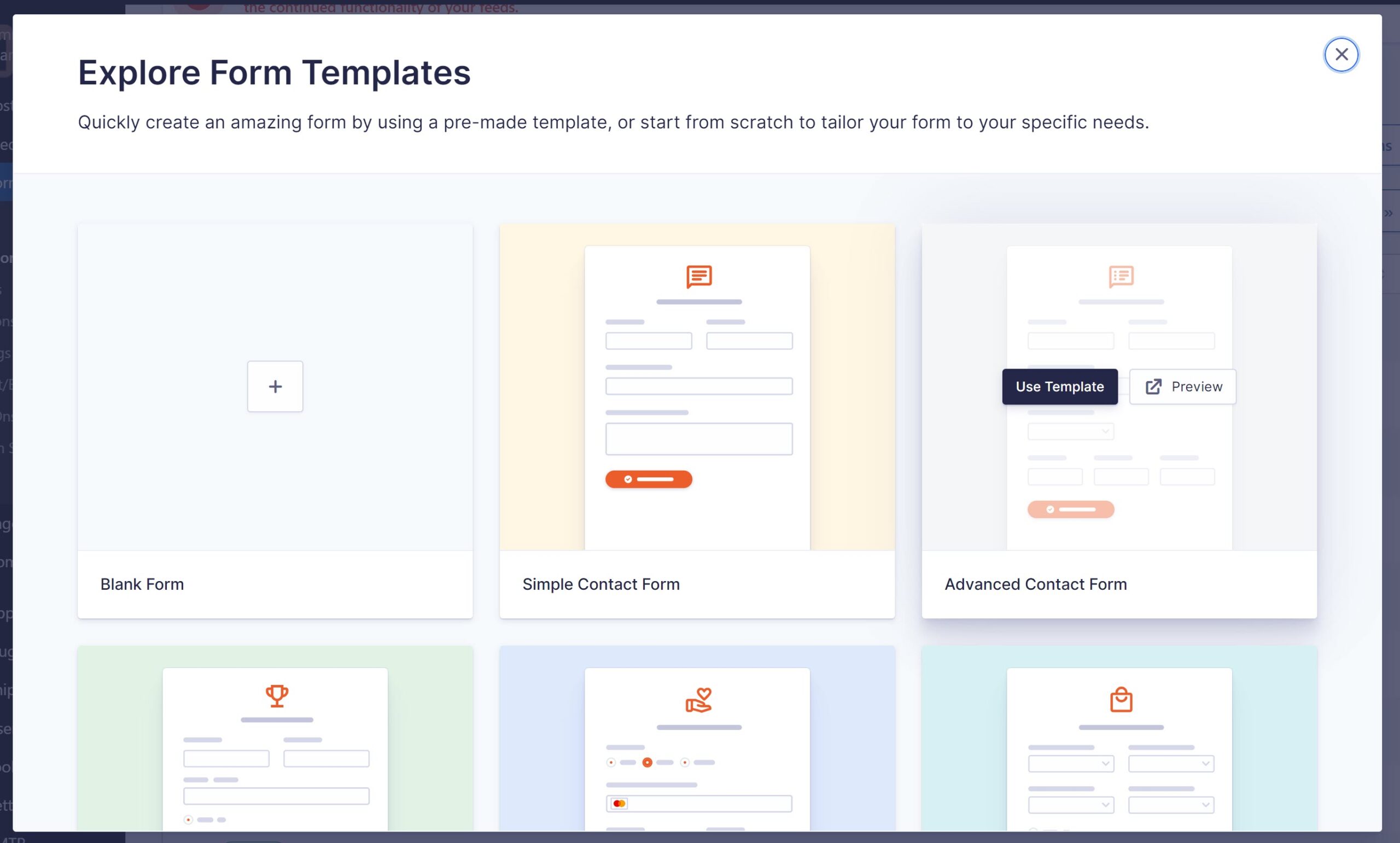
Step 2. Select any of the available templates or a blank form. We’re going with the Advanced Contact Form.
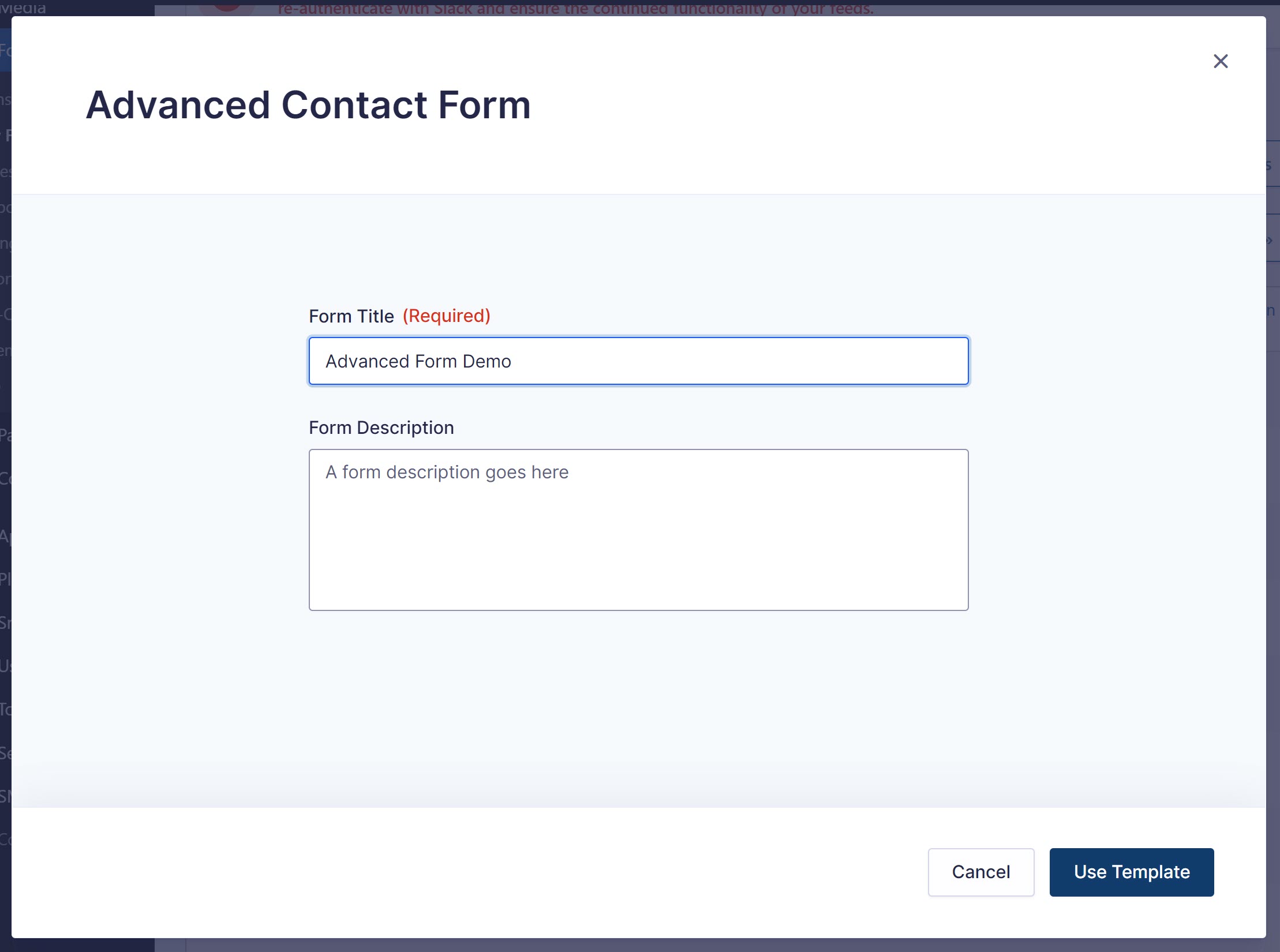
Step 3. Name your form (required) and add a description (optional).
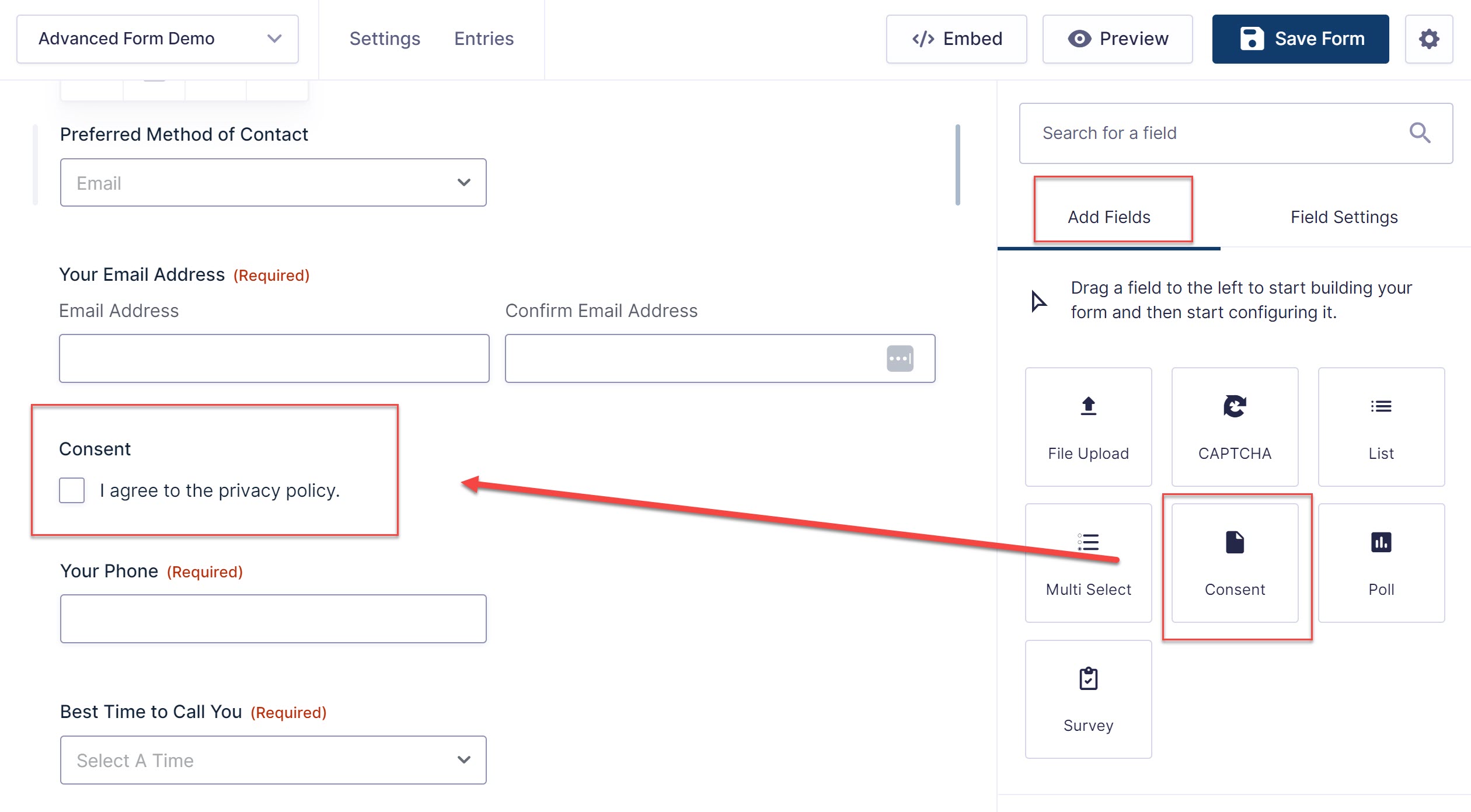
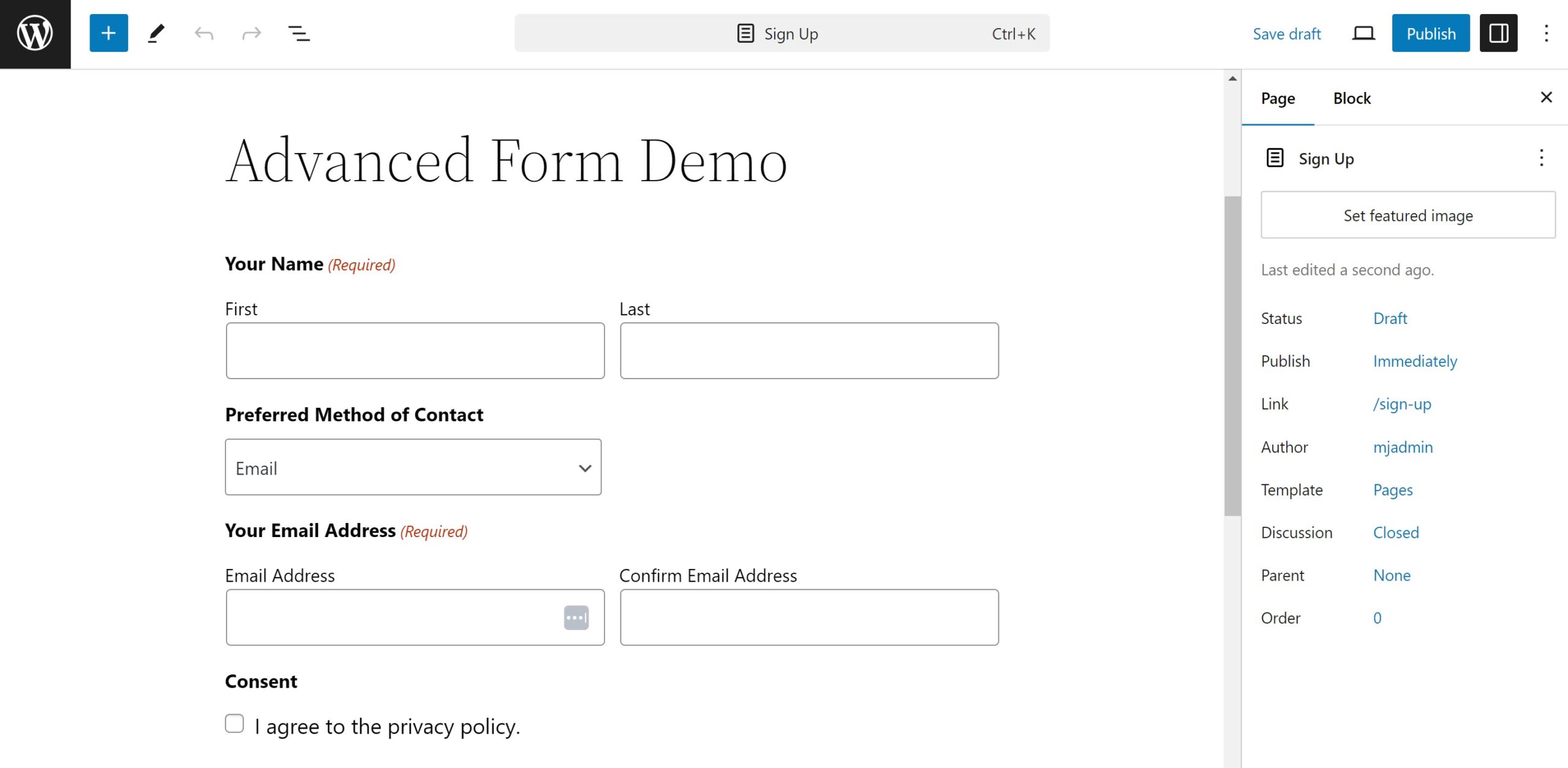
Step 4. Add or edit your selection of custom fields.
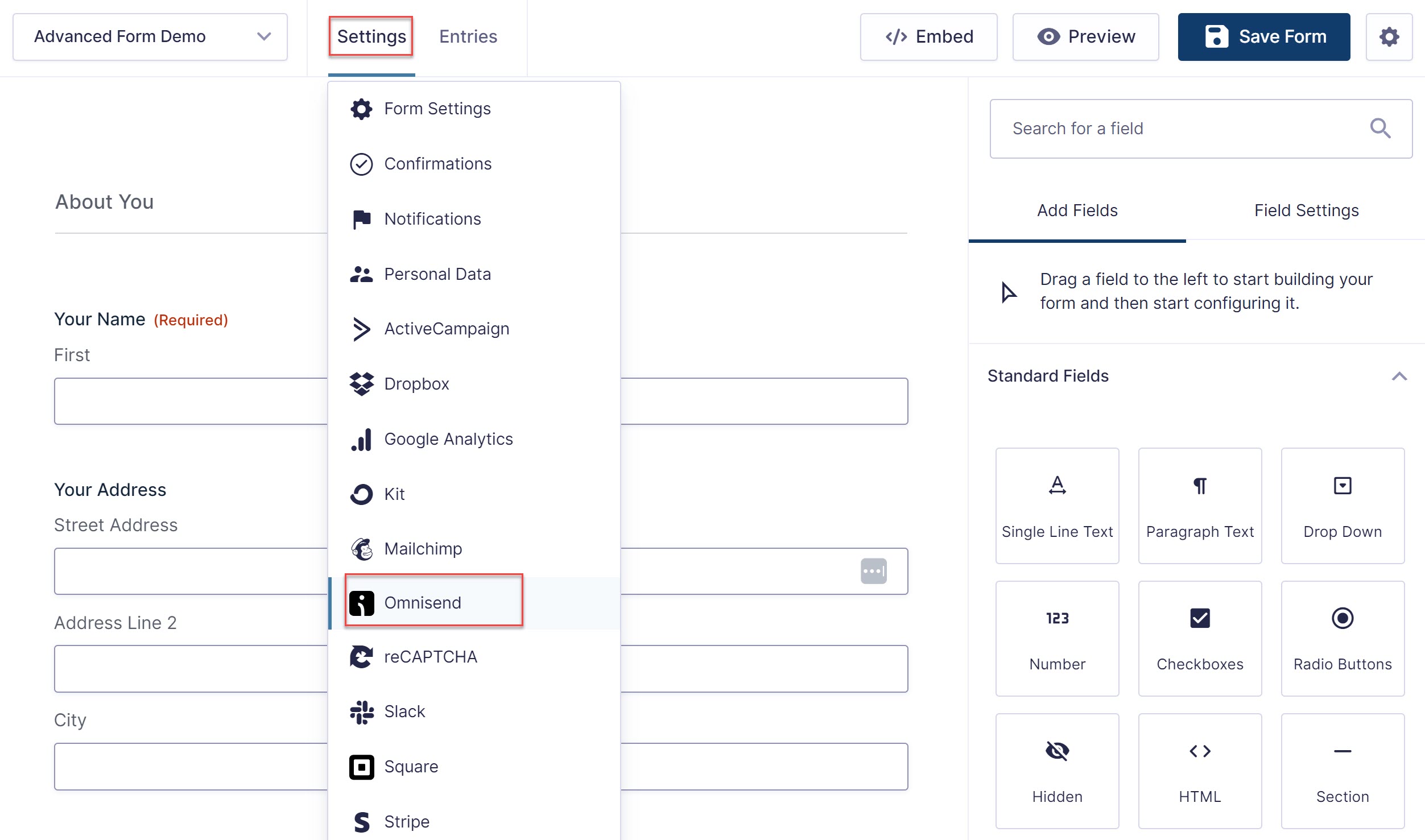
Step 5. Click Save, then navigate to Settings → Omnisend.
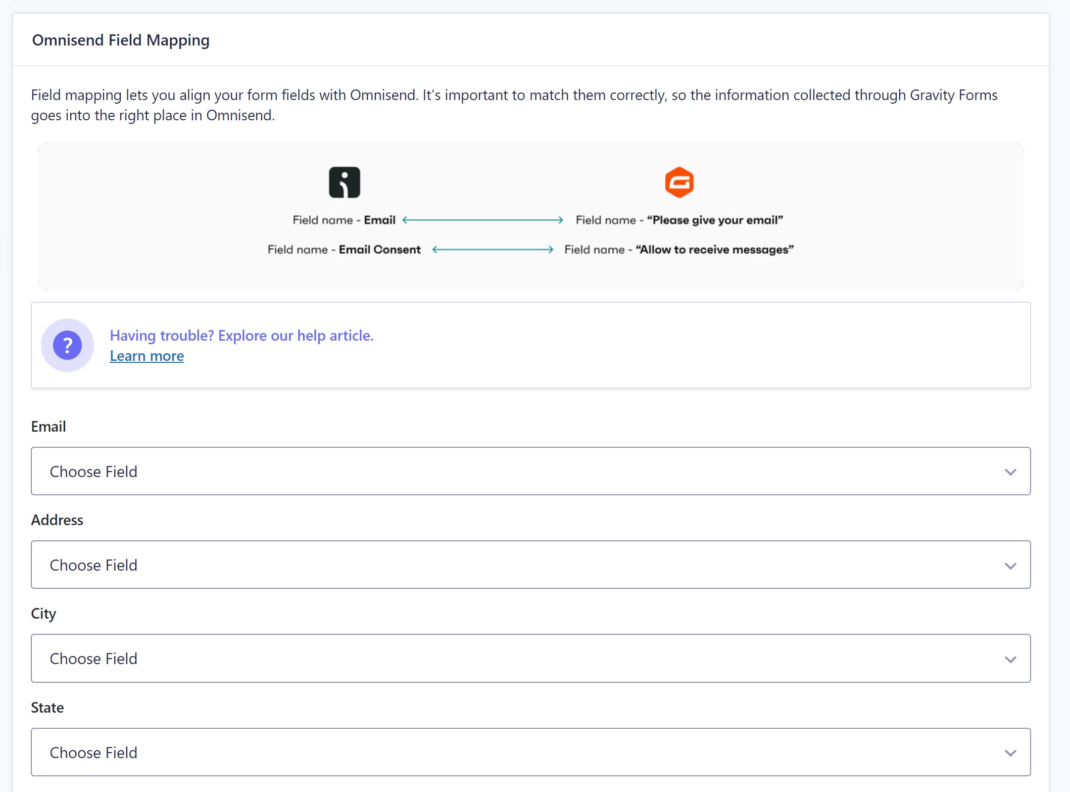
Step 6. Map all your captured fields to Omnisend’s properties.
Step 7. From here — you can publish your form on an existing page/post, create a new page/post, or copy a short code to be embedded anywhere on your WP website.
For more information on how to get started with Gravity Forms and Omnisend, check out the Omnisend Support Documentation.
Connect Gravity Forms and Omnisend Today!
By integrating Gravity Forms with Omnisend, you’ll be able to streamline your email collection process and take full advantage of Omnisend’s robust email marketing features.
To find out more about Omnisend, and if it’s the right email marketing tool for you, head on over to the Omnisend website and check out the advanced features, support, and pricing.
