Lead Generation Ideas: 5 Common Mistakes You’re Making

Whether you’re a blogger or a freelance web developer, trying to increase your own or your client’s lead captures can be a challenging task. While lead capture optimization does take a bit of time and effort, the most common pitfalls can be easily fixed—or avoided—once you recognize them. Below we have outlined five common lead capture mistakes to be aware of, along with expert advice about what to do instead.
Mistake #1: You’re Using an Unreliable Form Builder

One of the best ways to capture leads online is to present users with a sleek and easy-to-use form to provide their contact information. As you may have experienced when filling out online forms yourself, many forms are neither user-friendly nor visually captivating. That’s why it’s important to use a form that boasts both a strong UX and UI.
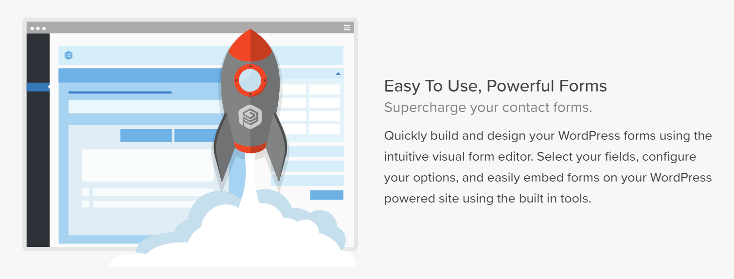
Gravity Forms has become a market leader in this regard by making it simple for developers and bloggers alike to set up forms that not only look good but enhance lead capture. In fact, you can even choose from different lead generation forms to find one that best suits your needs.
Although there are many different types of WordPress form builders, what makes Gravity forms distinct is its suitability for both experts and novices. For instance, developers will appreciate the level of control they can assert, whereas bloggers without coding skills will be happy to learn that they can make a professional-looking lead capture form with just a few clicks.
Mistake #2: You Aren’t Giving Users a Reason to Sign Up

Few people will freely hand over their information to a website without an incentive. With all kinds of online offers tempting users, there’s little reason for them to give away something for nothing. Nevertheless, this important consideration is often forgotten in the process of setting up lead captures.
You may wonder why no one is signing up and make every tweak to your lead capture except what you’re offering. The good news is that this is an easy problem to fix. Put yourself in your users’ shoes and ask yourself: “Why would I sign up?” If the answer isn’t clear, you need to determine what would be enticing to your demographic.
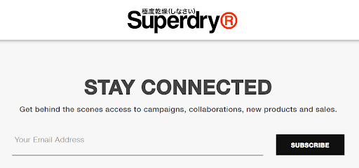
Perhaps you can email them weekly expert tips from your CEO. Or maybe offer a free download of an interesting white paper your company has published. You could even take a lead from popular clothing brand Superdry and keep it simple. They entice potential customers with the promise of “behind the scenes access to campaigns, collaborations, new products and sales.” There is no shortage of ways to incentivize your customer to sign up, so be sure to captivate them with something they can’t say no to.
Mistake #3: Your Site Isn’t Mobile-Friendly
Considering that 70% of web traffic comes from mobile phones, it has become increasingly critical to ensure the mobile-friendliness of websites. Many developers and bloggers underestimate just how important mobile accessibility is when it comes to lead capture. It’s not just about having a CTA or a lead capture form that is mobile-friendly, either. The entire site—from the text and formatting to the features and speed—needs to be seamless for mobile users.
In short, a bad mobile experience will cost you customers. After all, who would willingly deal with skewed page borders, hard-to-read text, and—worse still—a terrible user experience when trying to use your lead capture? Potential customers will simply turn to your mobile-optimized competitors.
The easiest way to work out how your site appears on a mobile interface is to test it on a range of mobile devices. Pinpoint any issues and attend to them quickly so you can reverse any damage already done. If you’re looking for quick and easy ways to improve your mobile accessibility, take a look at this guide.
Mistake #4: Your Copy Isn’t Compelling Enough

A fundamental part of getting leads online is ensuring that the words presented to potential leads are as convincing as possible. This is easier said than done—there’s a fine line between being inviting and overly-eager.
So how do you write compelling copy that works to capture leads? You need master conversion copywriting. This style of writing is focused on delivering convincing messages that encourage readers to take action (in this case, sign up to your lead capture).
For a strong example of conversion copywriting, take a look at freelance developer Olly Cope’s website. He clearly explains why he’s worth hiring by highlighting his credentials, skills, and enthusiasm. Your copy should be equally convincing in explaining why it’s worth signing up to your site.
Mistake #5: You’re Too Pushy
The fine line between being inviting and pushy in copywriting also applies to your lead capture in general. Once you’ve created a sleek lead capture form and have devised some eye-catching copy, it can be tempting to feature your lead captures at every turn.
However, this could have the opposite effect to what you intend. Do you think a customer would feel compelled to sign up to your site if it was constantly bombarding them with messages and pop-ups to do so? Chances are it would leave them feeling overwhelmed and annoyed. Keep your customers’ needs in mind when deciding when and where to feature lead captures.
The best way to work out what your customers respond to is to conduct A/B tests to determine the best timing and positioning of your lead captures. You should also use A/B testing to pinpoint which copy is optimal and which type of form your customers best respond to.
Conclusion
There are several mistakes you could be unwittingly making that may adversely impact your lead generation goals. Whether you identified one mistake or many, you should take comfort in the fact that the five mistakes featured here are all easy to fix. In relatively minimal time, you’ll soon be able to reap the rewards of your efforts—more leads to help your business flourish.