5 Top Tips to Help Your Payment Forms Convert!
Well organized and highly optimized online payment forms can make all the difference to a business’s revenue. By taking the time to create user-friendly forms that enable your customers and clients to smoothly and efficiently complete an online payment, you’ll ensure high conversion rates for any/all payment forms on your site.
Here at Gravity Forms, we’re experts when it comes to all-things-forms! Below we’ve compiled a list of ‘top tips’ to help you ensure your payment forms are best placed to get the conversions you need. Let’s jump in…
1. Create Payment Forms that Appear Short and Simple
Best practice for any form is to keep it short and simple. But even if your payment form isn’t that short, it should always give the appearance of being so!
Long forms are daunting for customers, but there are plenty of ways to ensure that even the longest of payment forms give the impression of being short and manageable. Here are a couple of easy-to-implement strategies…
Build Multi-Page Forms
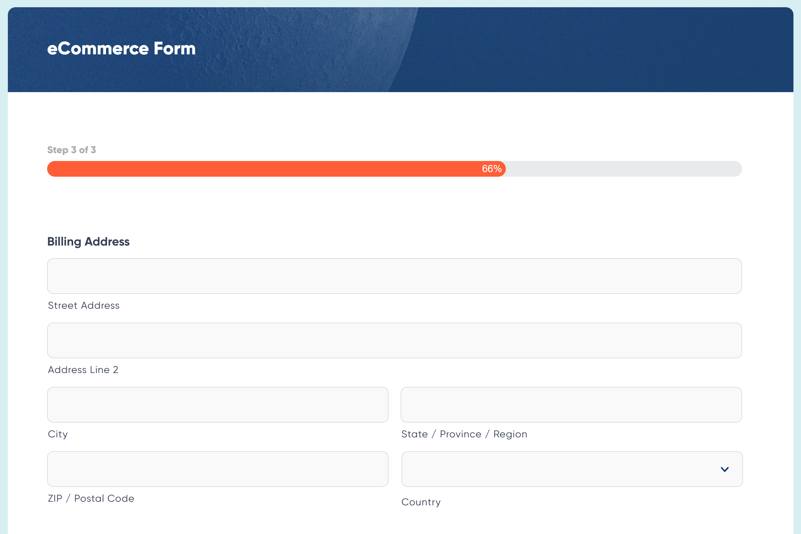
By splitting your form up into numerous pages, you ensure that customers never feel overwhelmed by the sheer number of fields on a page. You can also use a multi-page layout to better organize your form into intuitive sections or steps in a process. For example, a payment form might keep billing information on a separate page from shipping information.
In addition to this, with Gravity Forms, you can include instructions on each page and use a progress bar or progress steps to help users track their progress toward completion. These visual indicators help reduce frustration and improve the overall user experience of your forms.
Use Conditional Logic
With conditional logic you can create a tailored form experience for each customer, only showing the fields that are relevant to a particular user, based on their previous input.
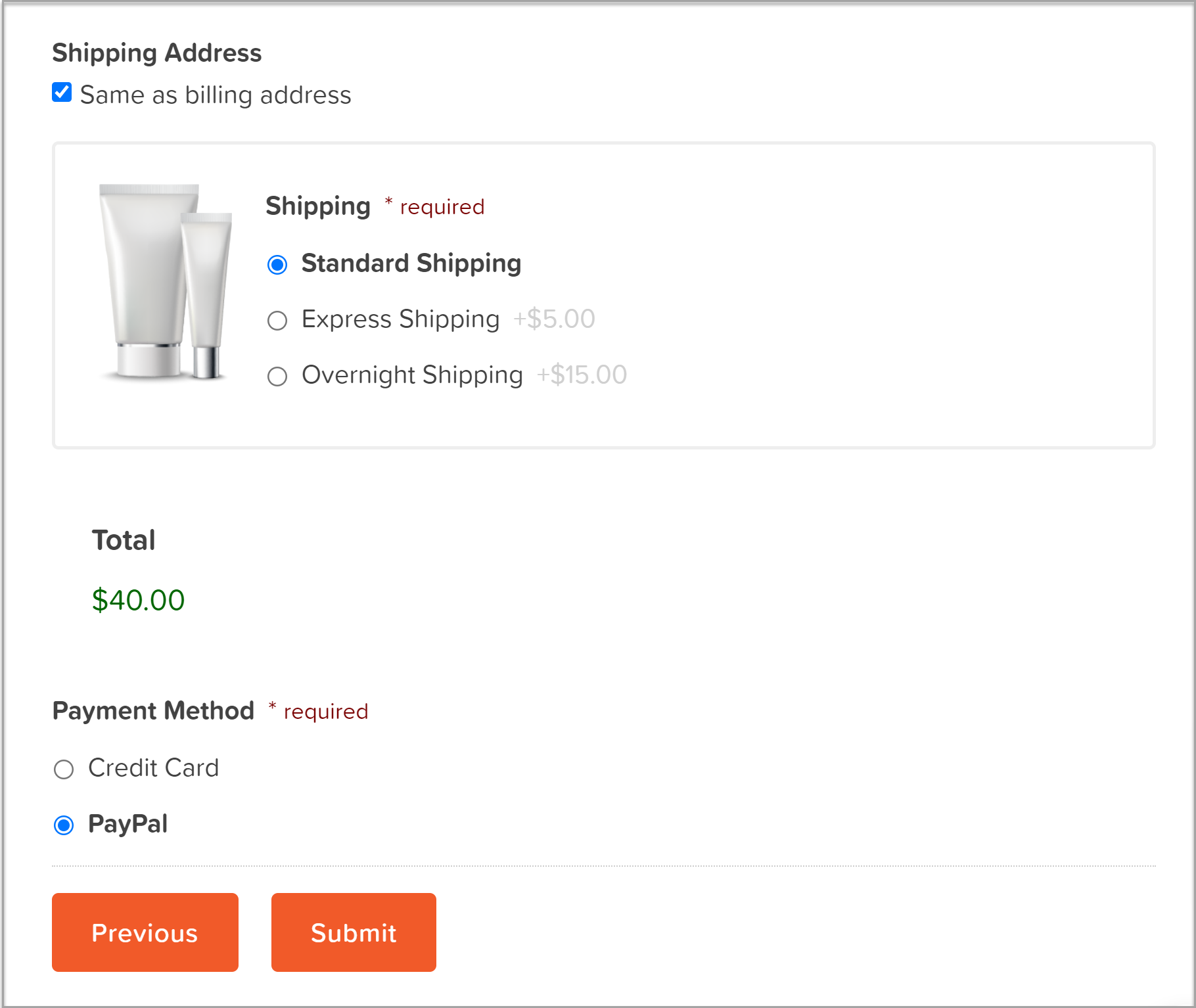
For example, with Gravity Forms you can give your users the option of selecting their preferred payment method and then display the specific fields for that payment method. For example, here we have provided the option of paying off-site with PayPal, or with a credit card via the form using Stripe…

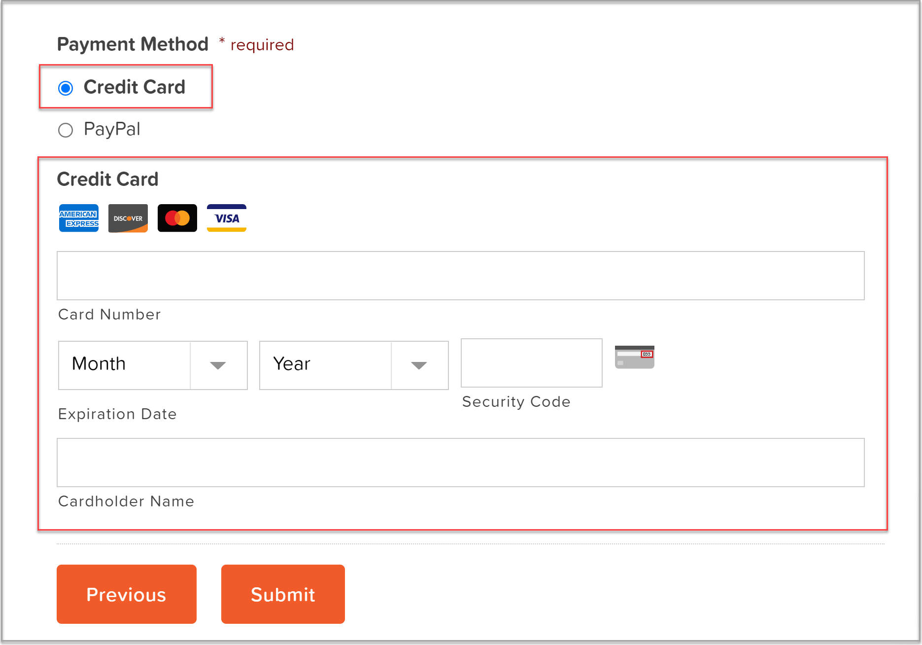
As you can see below, if the user selects Credit Card as their payment method, the credit card field is then displayed on the form…

By only showing the fields that are immediately appropriate to each specific customer, you keep the form experience short and relevant to the needs of each individual.
2. Reduce Friction Points
Friction points occur throughout the form journey – when a customer gets distracted or doesn’t like something they have encountered during the process. It is these friction points that will affect your conversion rates, so it is best to iron them out as quickly as possible. Here are a few that might be causing you problems…
- Distractions on the Checkout Page – Your checkout page should consist solely of your payment form. Extra text, links out to other pages, or any other eye-catching graphics or imagery can cause distractions and prevent customers from completing the form.
- Avoid Surprise Costs – Don’t let customers wait until the end of the transaction to learn about additional costs or fees. One of the most common reasons for form abandonment is high shipping prices – consider shipping for free and building shipping costs into your pricing strategy.
- Use Clear CTAs – Instead of using vague terms like ‘continue’ or ‘next’, use clear phrases telling users exactly what you want them to do next. For example ‘Complete Checkout’ or ‘Buy Now’.
3. Give Your Customers their Preferred Ways to Pay
Giving your customers options when it comes to payment, and providing them with their preferred payment methods, will significantly increase form conversions. If you’re using a WordPress form plugin like Gravity Forms, you’ll find a selection of payment processors to choose from, all offering a wide assortment of features and options, helping you to cater to your users’ payment needs.
Here are a few points to consider to ensure you choose the right payment options for your audience.
- Give Your Customers Options – With the Gravity Forms PayPal Checkout Add-On, customers can select to pay with PayPal, Venmo, iDeal, Pay Later options, and other country-specific payment methods. The Gravity Forms Stripe Add-On also allows users to pay with Google or Apple Pay. Let your customers choose the payment method that is easiest for them.
- Taking Payments Globally – If your audience is spread across the world you’ll want a payment processor that accepts global payments. A payment processor like Mollie specializes in European currencies and allows you to accept SEPA, SOFORT, Bancontact, Cartes Bancaires, and many more.
- Allow Customers to Manage their Own Subscriptions – With the Gravity Forms Stripe Add-On, customers can self-manage their subscriptions, including updating credit card information, viewing payment history, and more. By promoting this feature, customers can confidently sign up for a subscription service on your site, safe in the knowledge that they have full control over their payments.
By providing the right payment tools and options for your customers, you’ll help ensure they won’t fall at the last hurdle when completing a payment form.
4. Reconnect with Customers After Form Abandonment
Of course, however well you’ve optimized your payment forms, there are always going to be some abandonments. WooCommerce, Shopify, and other shopping cart applications have abandoned cart technology – it’s important that your payment forms are supported by the same technology!
With the Gravity Forms Partial Entries Add-On, you can easily capture those partial form entries that have been abandoned, helping you to recover the details of potential customers. You can then send follow up emails, encouraging them back to your site to make the purchase.
It is important to note that this add-on does not allow users to resume the partial entry, only for you to collect the data. If you want users to be able to resume the partial form entry, you need to enable the Gravity Forms built-in Save and Continue feature, and the user needs to manually click the save link before temporarily abandoning the form.
Another option is to use Gravity Flow, which has an integration with the Partial Entries Add-On, enabling an email to be scheduled when a form is abandoned. This email can contain a resume link, allowing the user to return to the form, which will be populated with the values from the last auto-save.
5. Track Form Performace
Tracking the performance of your payment forms is a must if you want to really understand how your customers are interacting with your forms and why they might be abandoning a form before payment is complete.
With the Gravity Forms Google Analytics Add-On, you can send both form submission and form pagination related events to your Google Analytics service, giving you clear insight into the performance of your forms. Monitor form conversions over time, get a clear understanding of your highest converting forms, or dig down to analyze specific revenue goals relevant to your forms and business.
You can also track multi-page form metrics across your site, giving you insight into user drop-off. Identify the barriers to form conversion, then tailor form length and content to help create a more user-friendly form experience for website visitors, ultimately helping to boost conversions.
Don’t Have Gravity Forms Yet?
If you don’t have Gravity Forms, don’t worry. Sign up for your own personalized Gravity Forms demo and see why Gravity Forms is the top choice for WordPress sites worldwide.
Already in love? Purchase our premium WordPress form plugin today!

If you want to keep up-to-date with what’s happening on the blog sign up for the Gravity Forms newsletter!


