How to Customize the Text on a Form Submit Button
The submit button is one of the most important elements of any form, but it is often overlooked. Displaying a clear call to action (CTA) on your submit button will grab your users’ attention and encourage them to submit that form.
By default, the submit button on any form created using Gravity Forms simply reads ‘Submit’. However, we recommend that, for the majority of situations, you customize this text, adding a clear CTA that is relevant to your form and appeals to your audience.
In this article, we discuss the importance of choosing the right CTA for your form, look at some examples from the Gravity Forms website, and crucially, walk through how to customize the text on a submit button when you create a form with Gravity Forms.
Let’s get started…
Use a Strategic Call-to-Action
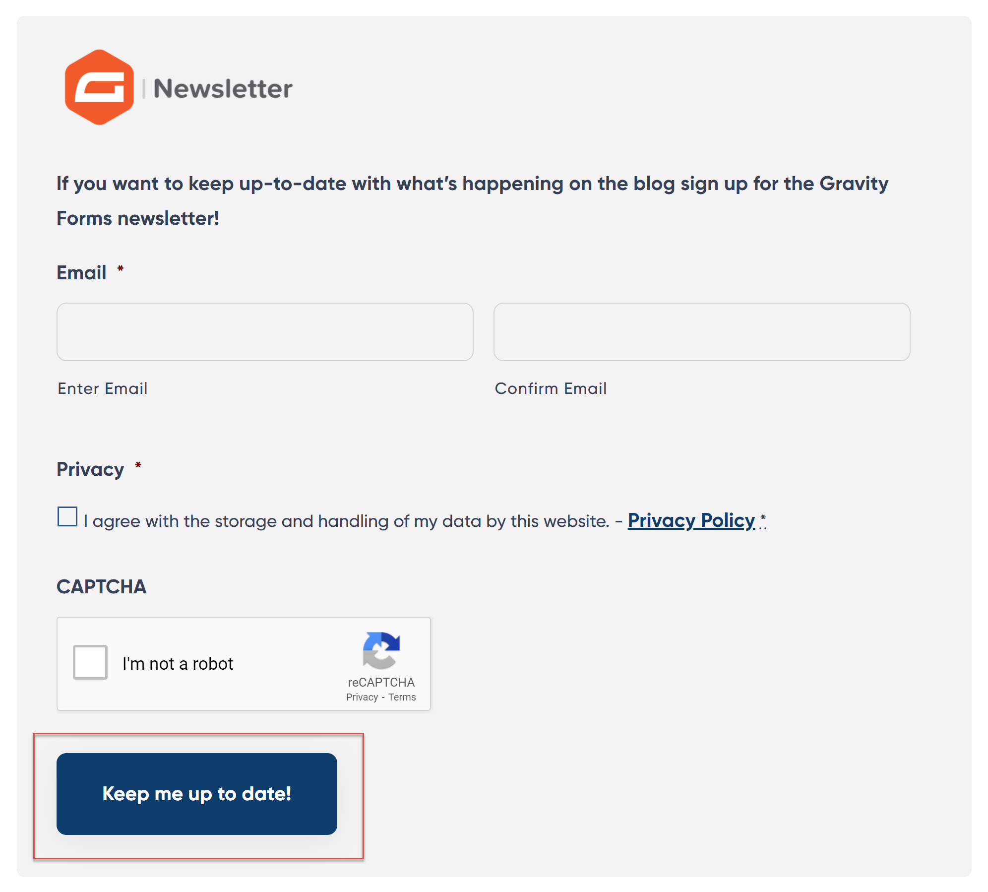
A strategic CTA makes it clear to users what action they need to take on your site. In the case of a form, the CTA on your submit button will encourage users to complete and submit the form – ultimately boosting form conversions and helping your site convert again its goals.
The CTAs used on submit buttons will differ greatly, depending on the type of form you have created, the content, and your audience. An attention-grabbing CTA will remind your users of why they began to fill out the form in the first place and the benefit of submitting it.
Let’s have a look at some examples of CTAs on our website…
The Gravity Forms Demo form submit button…

The Form Template Library submit button…

The Gravity Forms contact form button…

Other CTAs could include…
- Sign Me Up
- Register Now
- Subscribe Today
- Join Us
- Create My Account
- Get a Free Quote
- Claim Your Free E-Book
- Get the Guide
- Get Your Free Demo
- Start Your Free Trial
- Try It Now
- Order Now
- Buy Now
- Get Pro Now
So now you have some good ideas for the CTAs on your forms, let’s next find out how to customize the text of the submit button with Gravity Forms…
How to Customize the Text on a Submit Button
When you use Gravity Forms to create your web forms, altering the text on a submit button is a quick and easy process.
To do so, open a form within the form editor and locate the submit button.
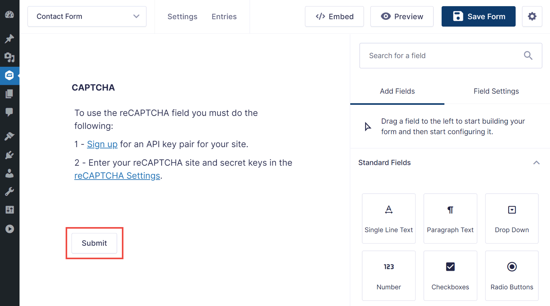
Click on the Submit button and the Field Settings for the button will be displayed in the right-hand panel.
You can then edit the text in the Submit Button Text field to create the perfect call-to-action for your form.
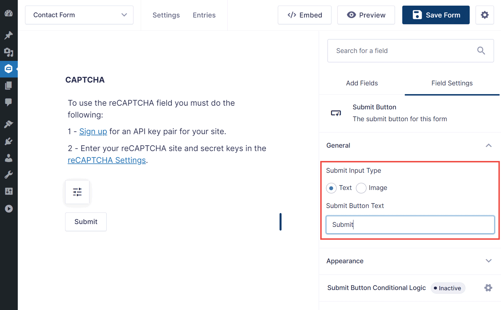
How to Use an Image as the Submit Button
You can also use an image as the button. To do so, select Image under Submit Input Type.
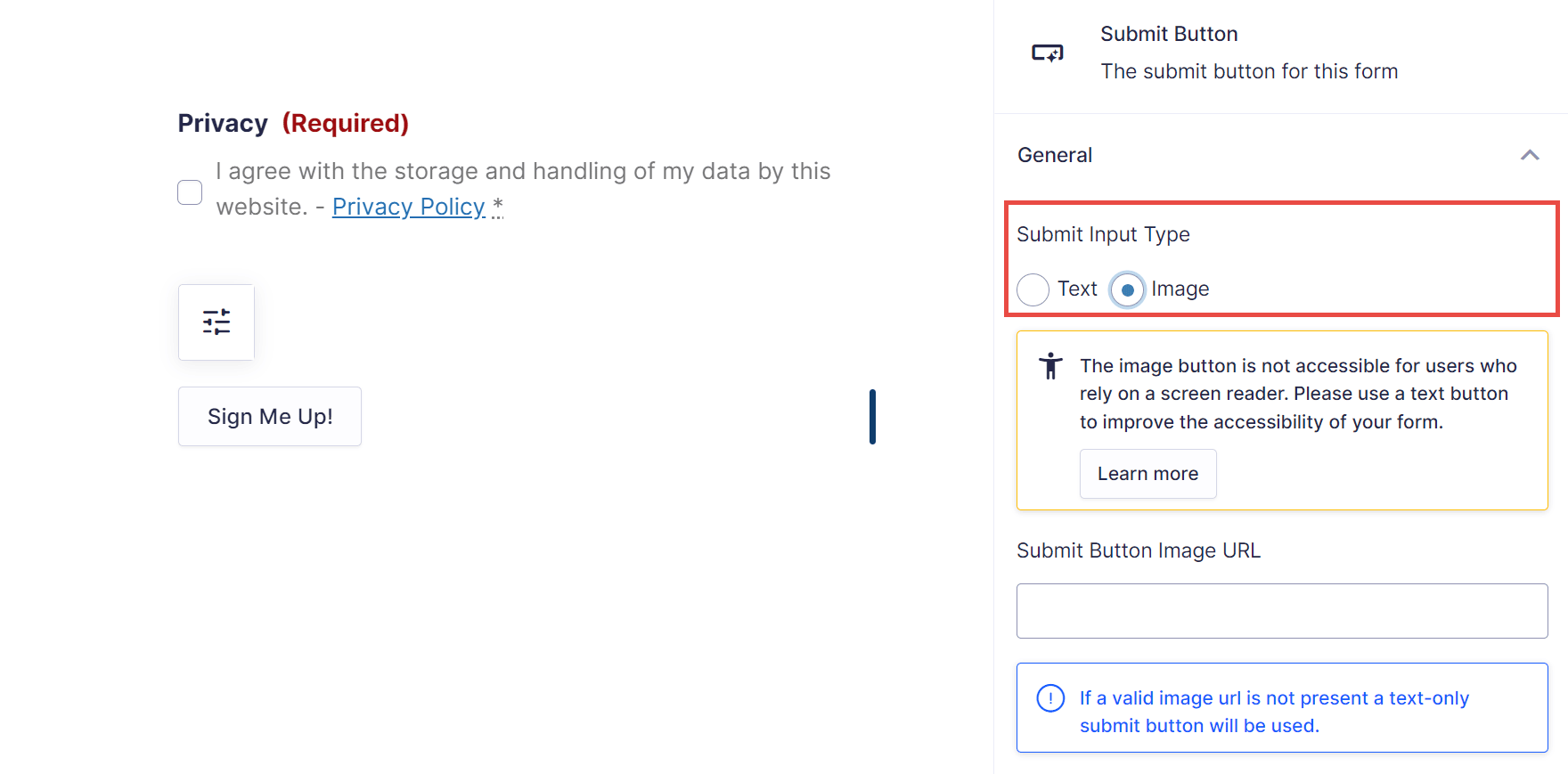
You can then enter the URL of the image you’d like to use. If you want to use an image as the button, you can upload the image file to your WordPress Media Library (Media > Add New Media File).
From the Media Library, click on the image once you’ve uploaded it, and then click on the Copy URL to clipboard button.
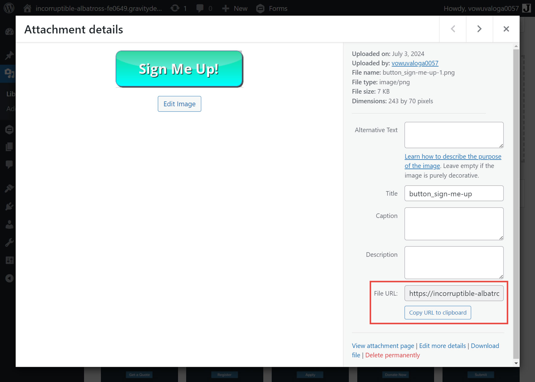
Return to the Form Editor and paste the image URL you just copied into the Submit Button Image URL field.
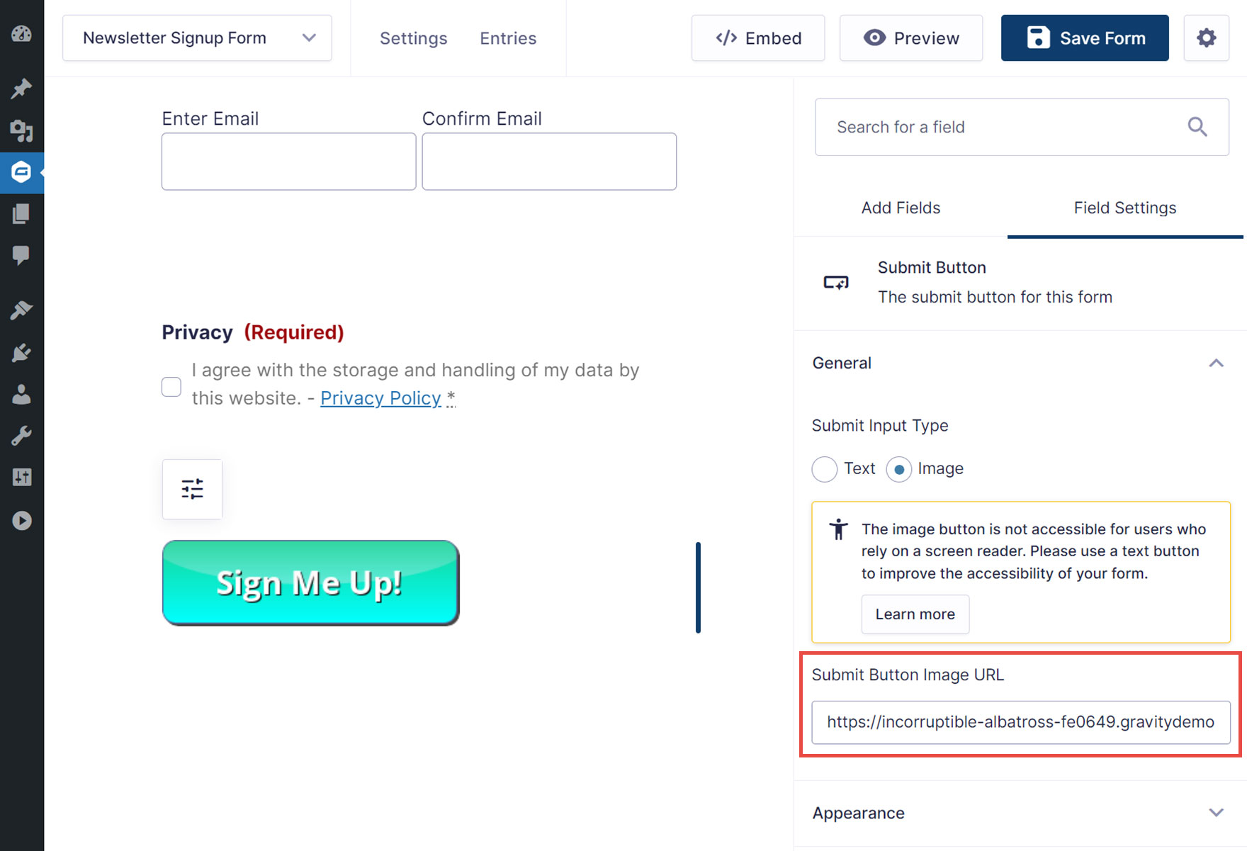
Once you’ve finished customizing the button, click the Save Form button in the top right corner of the editor.
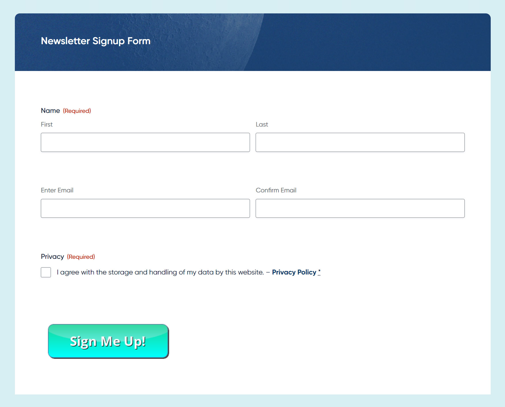
You can then Preview your form to check out your new button!
How to Customize the Submit Button in Other Ways
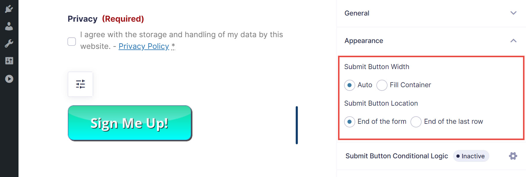
As well as customizing the button text and using an image as the button, you can also customize its appearance in other ways.
One option is to select Auto for the width. This sets the width to match that of the button text or image. Alternatively, you can set it to Fill Container, which sets the width to fill 100% of the container.
Another option is changing the location of the button. The two options are End of the form, which will place the submit button in a new row after all fields of the form, and End of the last row, which will place the submit button on the last row of the form where it will fill the remaining space left by the field columns.
Use Conditional Logic to Control the Submit Button Visibility
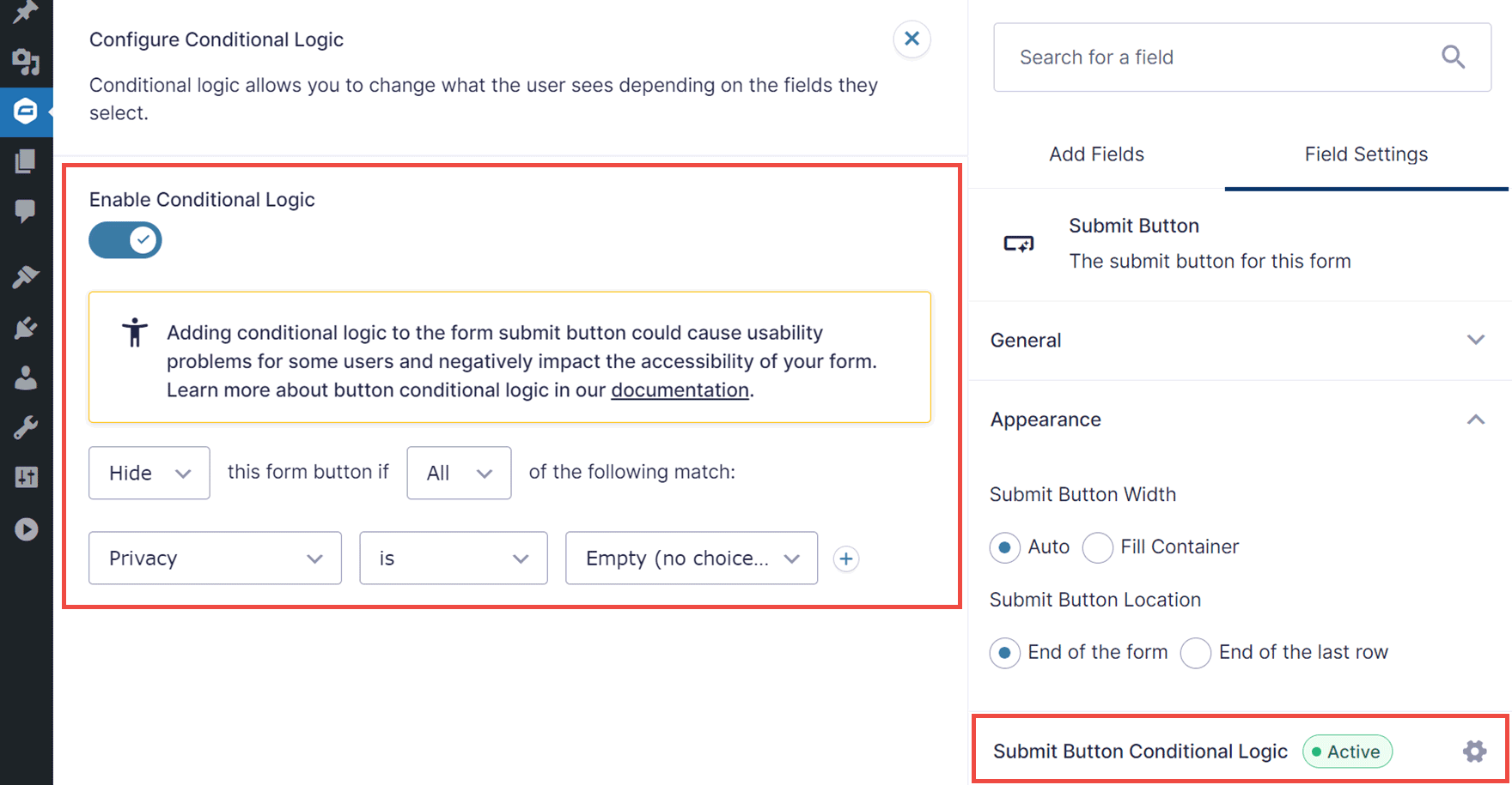
Conditional logic can also be applied to the submit button. This can be used to dynamically display or hide the button based on the contents of the other form fields.
For example, you could hide the submit button until all or some of the fields have been completed. This would prevent users from submitting incomplete forms or if they haven’t checked the privacy policy field.
Styling the Submit Button
Once you’ve added a form to a post or page on your site, you can style the form to suit your preferences.
To do so, open the post or page that contains the form in the WordPress Editor. Then, select the form. You’ll know you’ve selected the form when the Block on the right side panel is shown as Form.
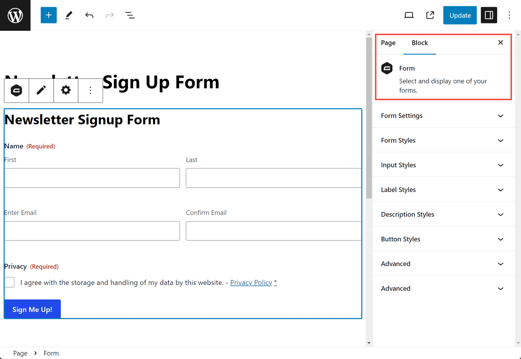
To access all the form styling settings, select Orbital Theme from the Form Styles dropdown menu.
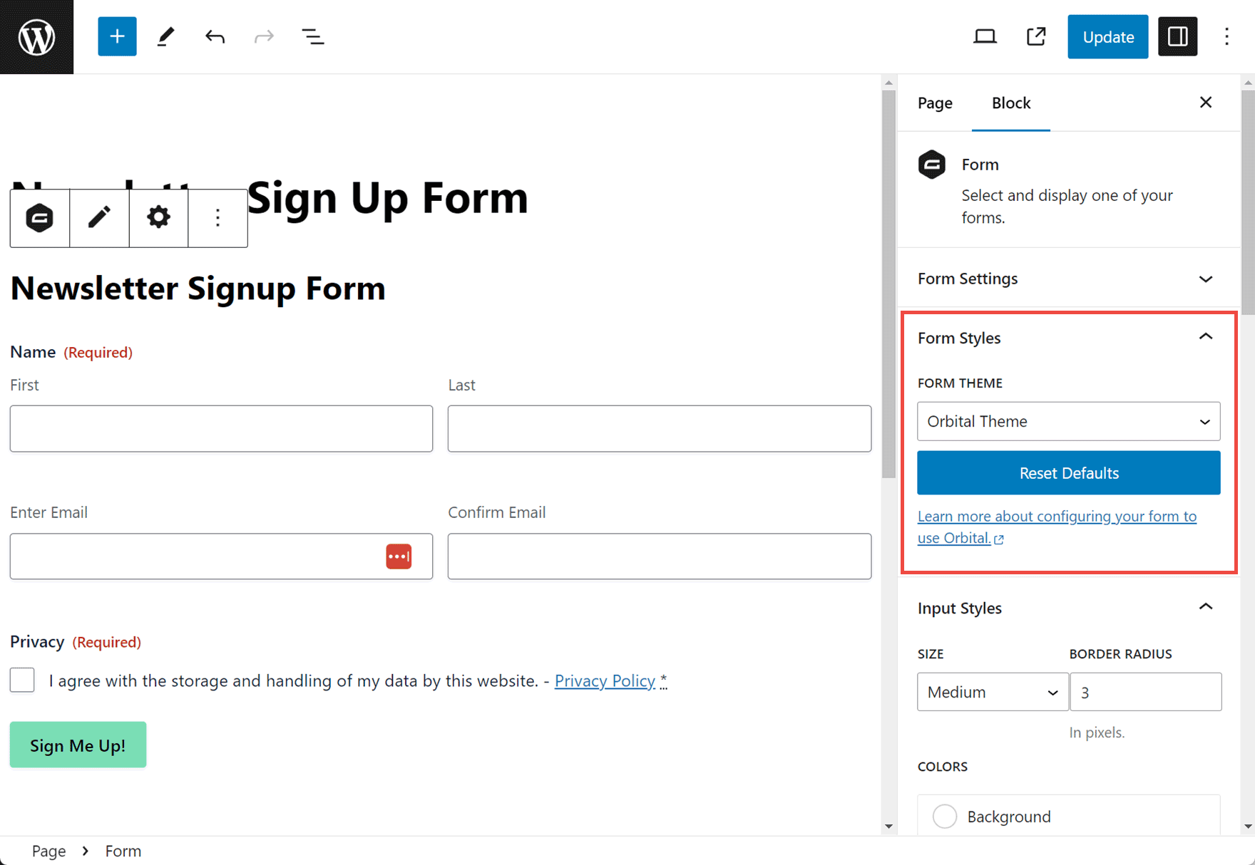
Once you’ve selected Orbital Theme from the Form Settings panel, you can customize many aspects of your form. To style the form button, click on the Button Styles section to expand the panel.
You can then change the color of the text and background of the submit button.
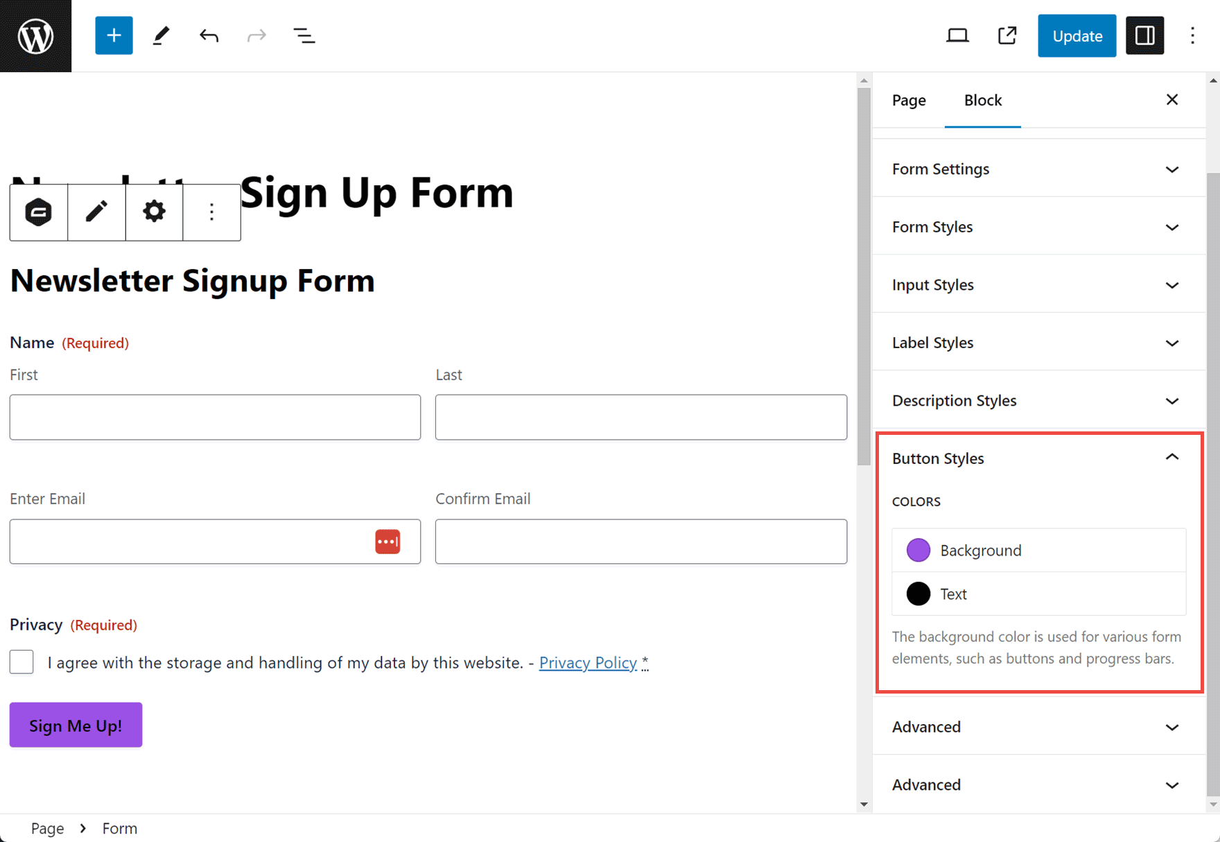
When you’ve finished, click the Update button in the top right corner to save the changes.
For more information on other Form Settings, check out the Gravity Forms docs.
Final Thoughts on Customizing the Text on a Submit Button
As you can see, customizing your submit button is a quick task, but one that definitely has benefits. By displaying an attention-grabbing CTA on your submit button, instead of just the default ‘Submit’, as well as customizing its appearance, you will help inspire your users to complete and submit the form, consequently improving your form submission rates.
Not yet a Gravity Forms customer? Find out what types of forms you can create with our free demo – Sign Up Today!

If you want to keep up-to-date with what’s happening on the blog sign up for the Gravity Forms newsletter!

