How to Create an Accessible Form (with Gravity Forms)
This month has seen the release of the latest version of our form builder – Gravity Forms 2.5. Alongside many impressive improvements and additions to the form editor, with Gravity Forms 2.5 you now have the ability to easily create accessible forms that are WCAG 2.1 AA compliant.
In this article, we will walk you through how you can use our form builder to create accessible forms. We’ll also cover issues to be aware of, and the importance of not just focusing on the form, but on taking a more holistic approach and ensuring that all other elements of your website are compatible with the accessibility outcomes that you want to achieve.
Let’s get started…
Gravity Forms 2.5 and Accessibility
Gravity Forms has undergone a major redesign when it comes to accessibility, making it quicker and easier than ever to create accessible forms. With accessibility improvements across the board, here are just some of the changes you will find…
- More robust HTML5 semantics
- Enhanced screen reader feedback for users who are blind or visually impaired
- The possibility of providing feedback on form errors
- Improved keyboard usability
- Warnings in the Admin about fields or settings with accessibility issues
The result of these updates to Gravity Forms means that with 2.5 you can now create accessible forms that are WCAG 2.1 AA compliant.
That said, Gravity Forms offers a wide assortment of features and functionality, which do not ALL lend themselves to accessibility. Therefore, when creating an accessible form, there are some key issues to be aware of, settings to use, and fields to avoid (all of which will be covered shortly).
It is also important to note that although our form builder provides the tools to create accessible forms, the key component to accessibility is the site owner! It is vital that you ensure you have created and implemented your forms correctly, and that other components of your website, like your theme, are accessible.
If you have strict compliance requirements, we recommend that you bolster the knowledge provided in our documentation with the expertise of an accessibility consultant or advisor.
For further information on Gravity Forms’ focus on accessibility, as well as more on the importance of web accessibility, check out these articles…
- Introducing the New 2.5 Features: Accessibility
- Gravity Forms Accessibility Documentation
- Web Accessibility: What is it and Why is it Important?
- Grow Your Business with Accessible Forms (The Business Argument for Accessibility)
How to Create an Accessible Form
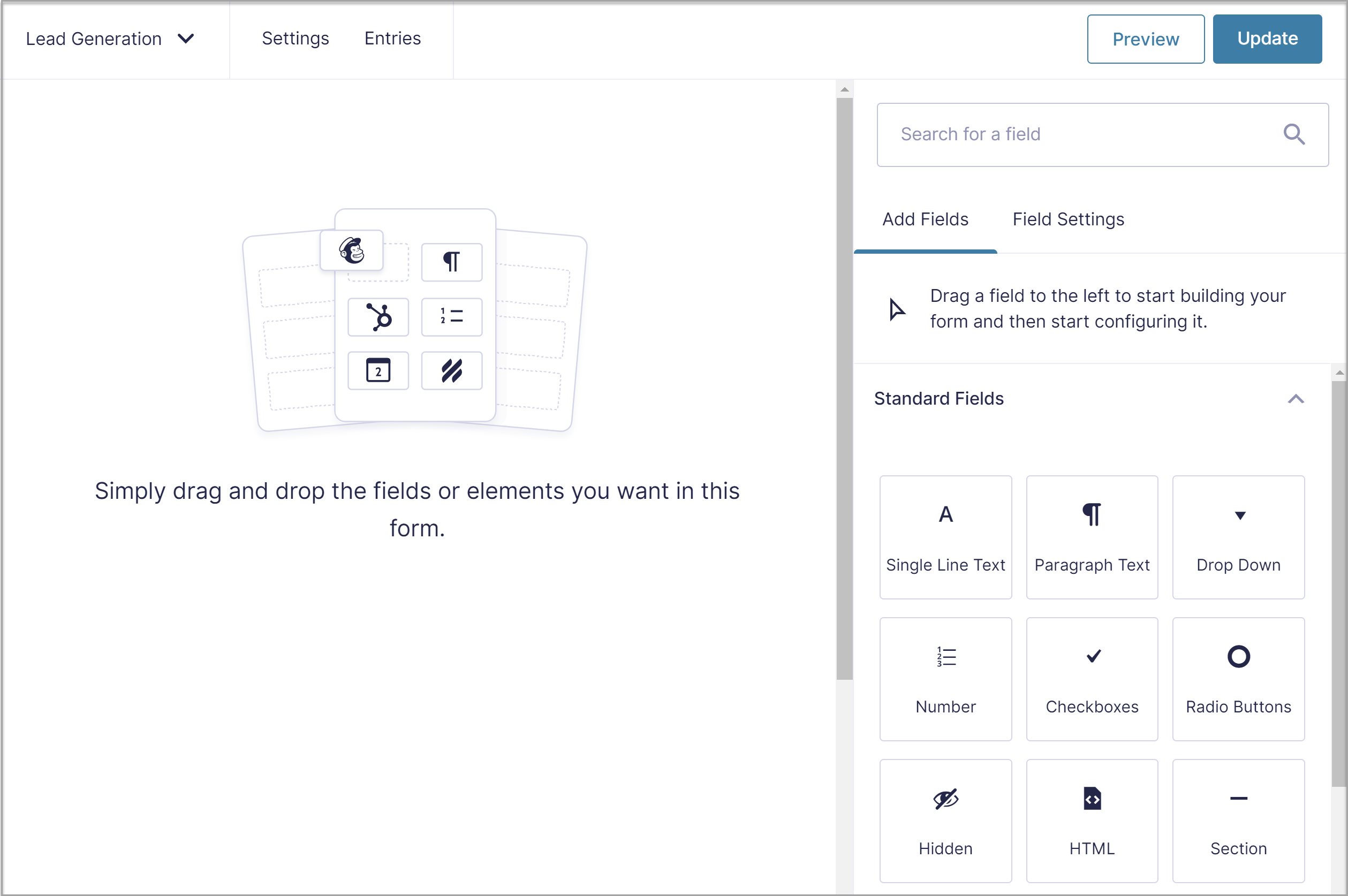
Gravity Forms 2.5 has seen a total redesign of the form editor UI as well as the introduction of new ways of working, including drag-and-drop column control. So to get started with your accessible form, open a new form and simply drag and drop the form fields you need onto the form editor canvas.
 Form Layout
When creating an accessible form, organization of the form layout is extremely important. Long forms particularly need to be well thought out, with form fields presented in an intuitive and logical order, ensuring they aren’t overwhelming for users.
One of the easiest ways to do this is to follow UX good practice and create a multi-page form. By grouping fields, and only displaying one set of form fields per page, forms immediately become more manageable.
Progress Bar
The W3C also recommends indicating the progress a user has made towards form completion. This helps the form become less daunting and helps users orientate themselves within the process.
As part of the multi-page functionality Gravity Forms provides, there is the option of displaying a progress bar or progress steps. For more information on how to create a multi-page form that displays a progress indicator, check out this article – How to… Create a Multi-Page Form.
Form Instructions
Form instructions are another vital element of accessible forms. Accessible forms should communicate exactly what users need to do, removing all guesswork and helping to walk users through each step.
The W3C recommends that overall form instructions should be displayed right at the beginning of a form, so they can be announced by screen readers before users begin to complete the form.
Accessibility Tip: Form Fields
The following field types can create accessibility issues and are not recommended for use in an accessible form…
- Multiselect (This field is difficult for people using a keyboard or assistive technology like a screen reader or voice recognition software, as they are not able to properly select multiple options. A better choice is to use Checkboxes).
- HTML blocks with text that contain essential information
- Section breaks with text that contain essential information
- reCATPCHA V2 (An accessible alternative is the Honeypot feature – found in Form Settings).
Field Settings
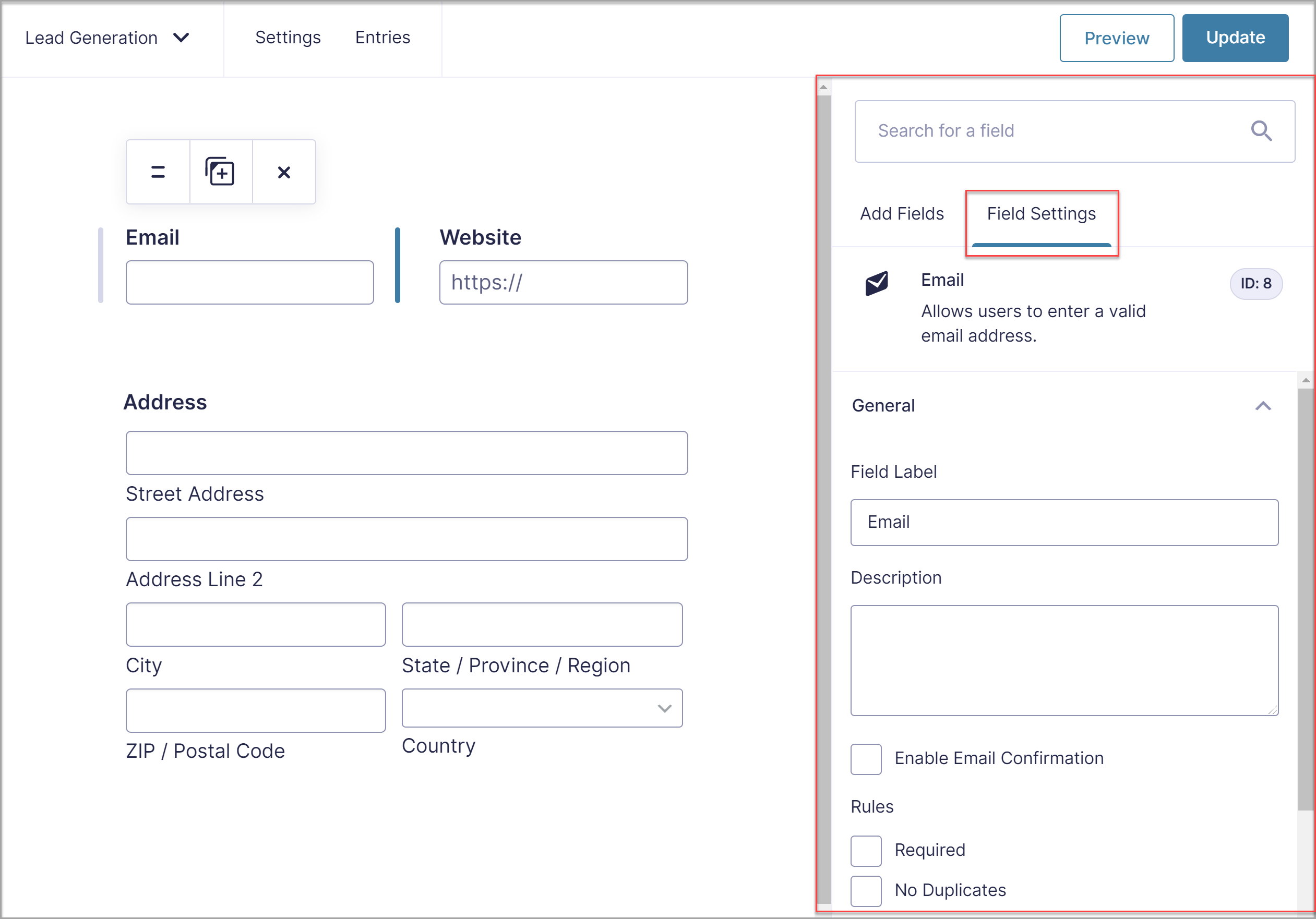
 When configuring your form field settings, there are a number of points to take into consideration, the first being how you label your fields…
Field Labels
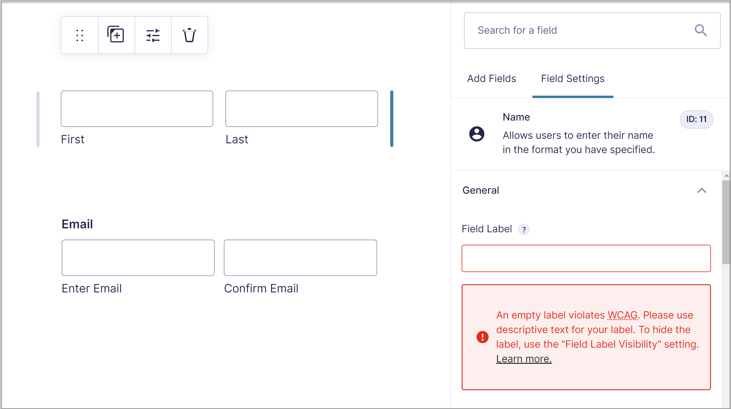
Form fields without explicit labelling can prevent people from easily accessing your form. Poor labelling may result in people not being able to identify what information is needed for each field – this can particularly affect the user experience of anyone using a screen reader, or a device with a small screen.
When creating accessible form fields, you must always use visible labels, not just placeholders. Assistive technology doesn’t always identify placeholders – instead add clear, meaningful labels that are positioned above the field. To counter this issue, Gravity Forms will automatically use the placeholder as the label if a field label is missing.
Field Descriptions
If you need to add extra information, best practice with Gravity Forms is to add this info into field descriptions. Gravity Forms descriptions are accessible by screen readers, so this text will be read aloud to the user.
Custom Validation Messages
Gravity Forms also displays a default error message if users try to submit a form without adding the right information to a required field. However, Gravity Forms also allows you to create a Custom Validation Message, giving users more insight into where they’ve gone wrong.
By creating your own custom error message, you can help users easily correct their mistakes and enter the right information into the right fields – a message like this not only helps make your form more accessible, but also will help boost submissions.
Accessibility Tip: Field Settings
Here are some accessibility points to consider when editing your form settings…
General Field Settings:
- Field Label: Always fill out the Field label, explain clearly to the user what needs to be filled out.
- Input mask: Do not use an input mask. Leave that box unchecked.
- Multi-File Upload: Do not enable Multi-File Upload with the File Upload field. Using single file upload is ok.
Appearance Field Settings:
- Field Label Visibility: Always use a visible label, never hide it.
- Sub-Label Placement: Above input.
- Custom Validation Message: If possible, write meaningful to-the-point custom error messages.
- Enhanced User Interface: Do not enable the enhanced User Interface for dropdowns.
Advanced Field Settings:
- Rich Text Editor: Do not enable the Rich text editor.
- Autocomplete: Enable autocomplete for name, address, and email fields. The default settings for these fields have the autocomplete values already filled out.
The majority of these settings are enabled by default with Gravity Forms 2.5. However, the exceptions to this are the settings for Sub-Label Placement and Autocomplete – you will need to manually alter these to ‘Above Inputs’ and ‘Enable’ respectively.
Accessibility Warning Messages
To make creating accessible forms easier and faster, Gravity Forms has introduced accessibility output warnings that appear within the form editor and form settings pages when you configure a form in such a way that would pose an accessibility issue.

Gravity Forms will display an accessibility warning message for any of the issues below…
- Using a field that could cause an accessibility issue.
- Configuring your field settings in a way that isn’t compatible with WCAG standards.
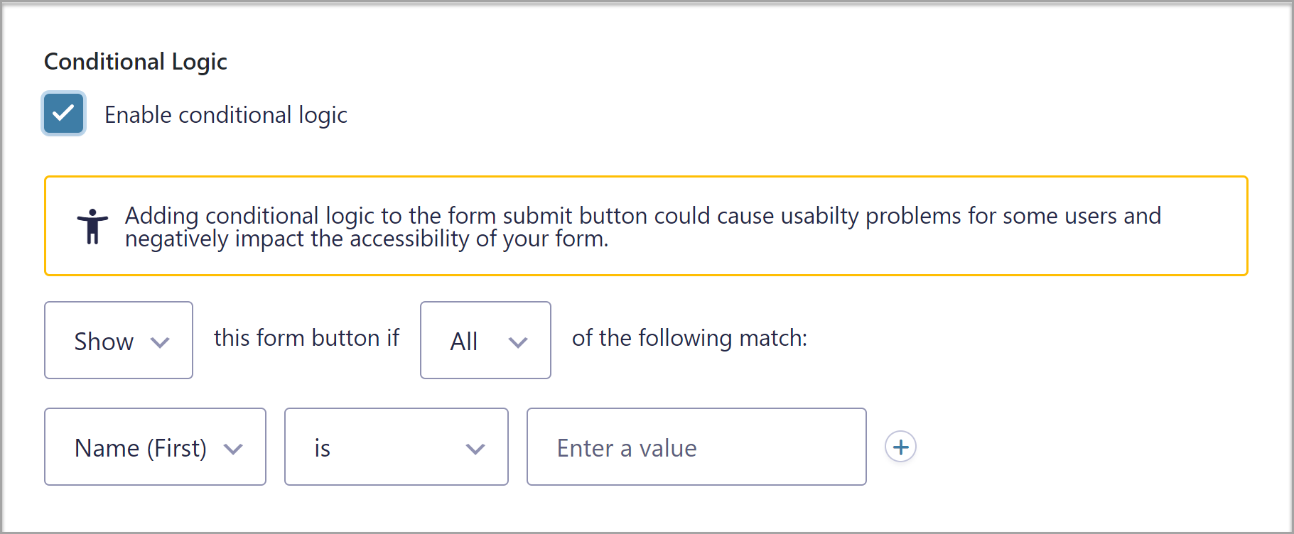
- Selecting form settings that could create accessibility issues – for example, using conditional logic to hide the Submit button on a form.

Other Settings
There are a number of additional settings that you need to consider if you want to create an accessible form. These include…
Gravity Forms General Settings:
- Output Default CSS: Must be ‘On’.
- Output HTML5: Must be ‘On’.
Form Settings:
- Label Placement: Must be ‘Top Aligned’.
- Sub-Label Placement: Must be ‘Above Inputs’.
- Validation Summary: Must be ‘On’.
- Required Field Indicator: Ensure the option to show a required field indicator is selected.
- Form Button: Choose ‘Text’ and use a descriptive text.
- Form Button: Do not enable conditional logic.
- Enable legacy markup: Must be ‘Off’.
Again, the majority of these options are enabled by default with Gravity Forms 2.5. The exceptions to this are the settings for Sub-Label Placement and Validation Summary – you will need to manually alter these to ‘Above Inputs’ and ‘On’ respectively within the Form Settings.
For more information on how to create an accessible form, check out this Accessibility Checklist.
WordPress Themes
The color contrast between the text and the background on your website can cause accessibility issues – your site visitors must be able to read the content in a form.
Gravity Forms ships with its own stylesheet (CSS). The color contrast is optimized for a white background color, but your theme may have a darker background color that makes text unreadable when you use the Gravity Forms stylesheet. Check the color contrast ratio between the text and background – it is required that the ratio is 4:5:1 or higher.
However, it is not recommended that you disable the whole stylesheet just for the color contrast. The CSS also controls the look and feel of form elements and the way error messages are displayed, which can also affect accessibility.
For more information on how to ensure your WordPress theme doesn’t impede your form’s accessibility, check out this Accessibility Guide for Developers.
Creating WCAG 2.1 AA Compliant Forms
With Gravity Forms 2.5 you can create forms that are WCAG 2.1 AA compliant – this means forms comply with the Web Content Accessibility Guidelines, version 2.1, level AA. These guidelines are set by the World Wide Web Consortium (W3C) and provide a global standard for accessibility, accepted by numerous countries around the world.
For example: WCAG 2.1 AA complies with section 508 (US), the European Accessibility Act, and the Equality Act 2010 (UK). Using accessible forms can help protect your website from accessibility-related lawsuits, a very real possibility to many industries, including government and non-profit sectors. For more details about the laws in your own country please check the W3C website Web Accessibility Laws & Policies.
However, as we have mentioned, having an accessible form builder plugin is not enough to ensure your forms are fully accessible and compliant with regulations. The options you choose, the settings you select, and the theme that your site uses, all contribute towards the accessibility of your forms.
For more information on how to create accessible WCAG 2.1 AA compliant forms, check out our extensive Accessibility Guides.
Final Thoughts on Creating Accessible Forms
The World Bank states that worldwide, ‘over 1 billion people benefit from improved accessibility’. Due to their complex nature, forms can be a major barrier to web accessibility for many, not least for those with cognitive disabilities and visual impairments – poor technology and small screens, as well as other situational limitations or temporary disabilities, can all prevent users from accessing web forms.
By creating accessible web forms, not only does your site become inclusive of all your visitors, you should also see an increase in form submissions due to improved form usability.
So, are you ready to create accessible forms with Gravity Forms? Get started today!

If you want to keep up-to-date with what’s happening on the blog sign up for the Gravity Forms newsletter!

