How to Use Social Proof to Improve Form Conversions

It’s a fact of life that people struggle trying new things. We like to wait to make decisions until we see other people make them first. If we see (or hear about) someone having a positive experience, we’re much more likely to take that step ourselves. That evidence is called social proof.
Social proof is based on the concept of normative social influence. This idea states that people conform to group behavior in order to be liked or accepted. If the pressure to conform is strong enough, it will nudge us in a particular direction, especially if we were considering that direction anyway.
In some cases of extreme pressure, normative social influence can even compel us to do things we ordinarily wouldn’t.
This means that you can nudge people toward a form conversion by displaying social proof on your landing pages and near forms to “borrow” influence from third-parties.
Conversion optimization specialist Talia Wolf says social proof is an important part of a conversion strategy. “As customers we buy products that make us feel good about ourselves, products that change us and make us better. By using social proof in the form of testimonials, reviews and trust icons, you’re helping customers make a decision, feel confident about their choice, and be a part of something bigger.”
What does social proof look like?
The Main Types of Social Proof
At its core, social proof is just a recommendation from one person or a group of people. In person, it’s a simple as your friend telling you they liked something (a purchase, a decision they made, a step they took, etc.).
Online, social proof is pretty much the same, but recommendations appear in different formats.
1. Testimonials
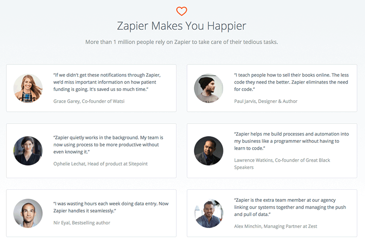
Testimonials are one of the most common forms of social proof. You’ve surely seen them all over the web, TV, and print ads.
Testimonials are short, to-the-point quotes from happy customers expressing their positive experience. They’re powerful tools for all types of landing pages to boost form conversions.

You can display testimonials by simply posting your customers’/fans’ words on the page, but a lot of brands have taken to embedding social media posts. These look organic and natural.
For best results, give your testimonials credibility by attaching a name, title (perhaps a company role), and a face to each.
2. Case Studies
Case studies are in-depth analyses of your customers’ experience with your products or service. Each case study is a review of how you helped a specific customer and how they benefited.
Prolific digital marketer Neil Patel uses them all over his sites.

Generally, case studies are heavy with data and situation-specific commentary. You’ll have to work closely with your happy customer in order to get enough information to document their experience.
Case studies are one of the hardest pieces of content to create, but they’re an invaluable way to convert bottom-of-the-funnel customers.
3. Reviews
Reviews are like testimonials, but they’re usually a little more in-depth. They come in two forms:
- Long, detailed reviews by bloggers and media sites.
- Short, to-the-point reviews from customers.
You can get reviews by prompting your customers to leave comments (and either auto-publishing them to your site or approving each manually).
You can also monitor popular forums and groups in your niche to see what people are saying and add it to your landing pages.
4. Trust Icons
Trust icons can mean a lot of things, but essentially they’re symbols or logos of brands or organizations your customers trust. The idea is that by associating your brand with those organizations, you’ll borrow some of that trust.
This is another extremely common form of social proof. It often takes the form of an “as seen in” row of logos…

…or a bank of icons near payment forms.
![]()
5. Hard Data
Numbers can be powerful to the right people. Sometimes all your users want to see is simple data to make them feel comfortable completing your form.
You might show…
- The number of people who have completed the form.
- The number of people on your email list.
- How many people have shared the page.
- A number-based benefit (“Sign up to learn how to save $657!”)
How to Use Social Proof
Now that you know what social proof can look like on the web, let’s talk about how to use it.
Each landing page is basically an argument you make to convince the user to fill out your form. So everything on that page should support your side of the argument, including social proof.
This means that your social proof shouldn’t just praise of business. It should counter your users’ specific objections. For example:
Bad: “Acme’s sales tool changed my life!”
This testimonial doesn’t tell the user much of anything. In fact, it’s so over-the-top that your users won’t believe it. Few products, services, or opportunities actually change our lives significantly.
Good: “Acme’s sales tool cut my sales cycle in half!”
This testimonial is far more specific and speaks to the user’s actual problem – a sales cycle they wish were shorter. It also uses an industry-specific term that makes the user feel like you understand their needs and problems.
Figure out the reasons your customers chose not to convert. Then craft social proof around those hesitations to help them overcome.
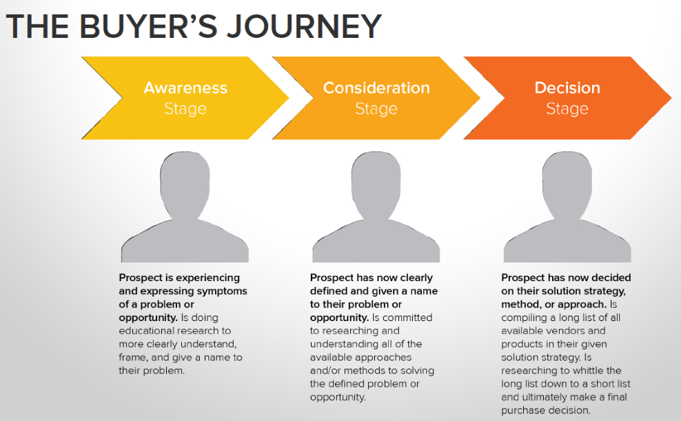
Furthermore, it’s important to place the right social proof at the right time. This requires an understanding of where your users are in their journey when they come across your landing page and form.
Map your users’ needs to the buyer’s journey.

If they’re just becoming aware of their problem, use social proof that connects with their symptoms. Example: “I had no idea I could be compensated for my suffering until I met Attorney Jones.”
If your users are at a later stage in their journey, use social proof that compares your solution to one of your competitors. Example: “I’ve spoke with a dozen lawyers, but Attorney Jones was the only one tough enough to take my case.”
Finally, be sure to humanize your social proof as much as possible. Use names and faces of actual people. Ideally, your prospects should be able to track down the authors of your social proof and confirm that they actually made those claims.
Which Types of Social Proof are Right for You?
Any time we talk about conversion optimization, it’s important to point out that there’s no “best” method. What works for one business may not work for another.
So it’s critical that you do two things:
First, talk to your customers. Find out what types of information they use to make decisions. If they like to see logos of other brands, use logos. If they like testimonials from influential people, use testimonials.
Second, A/B test your forms and landing pages to identify which social proof methods work best. Don’t rely on “gut feelings” or “know-how.”
Think objectively. Test pages with different types of social proof against one another to find the one(s) that creates the most conversions. Experiment with the type of social proof, content of the proof, and its placement on your page.
Going Forward
Social proof is an important part of any conversion strategy, but it isn’t the only part. Things like your calls-to-action, form layout, headlines and copy, conditional logic, and multi-page functionality are all important tools to maximize your conversions. Use them in concert to acquire the most sign ups.