Tips For Styling Beautiful Forms
Have you ever seen a design that makes you want to rip your eyes out? Yeah, we all have. In fact, even a beautiful website with an ugly form on a single page can ruin the entire experience. We’ve seen a lot of forms (including the millions powered by Gravity Forms), and we still cringe when we see a really ugly one.
Don’t want to have one of those ugly forms that makes us want to bleach our eyes? Here’s our tips on styling your forms to make your ugly duckling into a swan.
Use the Customizer

The easiest way to style elements of your website when using WordPress is by utilizing the Customizer, and the same still holds true when styling Gravity Forms.
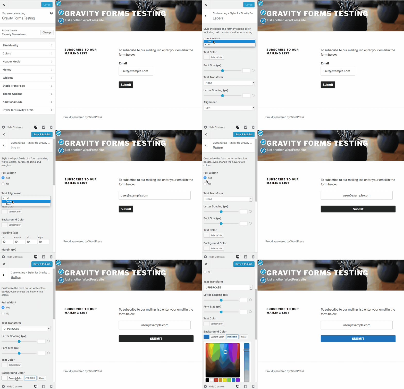
By default, you might not notice many options for Gravity Forms within the WordPress Customizer interface, but that can easily be remedied with the use of a 3rd-party plugin, Styler for Gravity Forms.
Once installed and activated, you’ll see additional options in the customizer when viewing pages that contain embedded forms.
Learn How to Blend In

While Gravity Forms does a great job of inheriting styles put forth by most WordPress themes, sometimes things don’t quite look ideal.
If you pay close attention to the styling of your theme, you can quickly match your existing look and feel within just a few minutes. Sometimes, only a few minutes of tweaking things can make a dramatic difference and can even increase your form’s conversion rates.
Be Bold

When you need to draw attention to something life a form, be sure it stands out. The design surrounding your page should be subtle enough not to draw attention to it, and the visitor’s eyes should be drawn toward the form.
To better understand how to do this, take a look at various forms on the websites you visit most. Pay close attention to how the page flows, and how your eyes are pulled from one element to another.
…Yet Tasteful

Remember all of those annoying marquee text blocks and animated GIFs back in the 90s? Don’t let your site look like that.
There are plenty or resources everywhere that can help you get a better handle on what to do (and not to do) with your form styling, such as one of my favorites: The Non-Designer’s Design Book.
Learn CSS (or get better at it)

CSS is how the internet is styled, and it’s a good idea to sharpen your CSS skills when dealing with anything displayed on a website. CSS is constantly evolving and the things you can do with it are continually expanding.
Not only will you be able to make better looking forms, but you’ll also improve your web design skills overall. Your code will become much cleaner and most design changes to your WordPress themes will become much easier.
Don’t know where to start? Check out Code Academy for a great free course that will get you through the basics and beyond.
Once you’ve honed your CSS skills, you’ll want to check out our CSS class documentation.
Utilize Your Browser’s Inspector

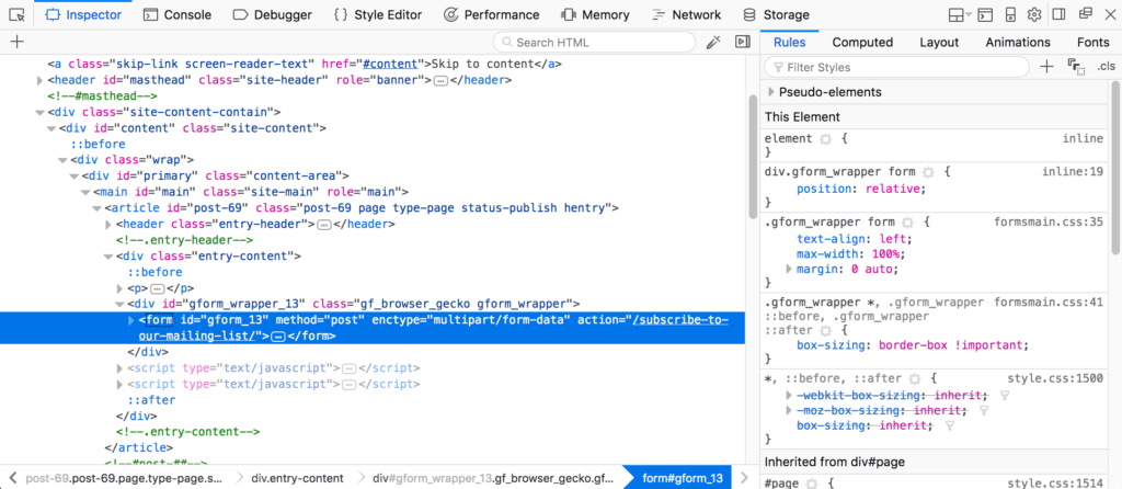
If you need to know what CSS rules apply to a particular element, the inspector in either Google Chrome or Mozilla Firefox will do the trick. It’s already built into your browser, why not use it?
When you need to find any information about an element on the page, just right-click that it and click on Inspect Element.
By utilizing the inspector, you’ll be able to get the CSS selector for the element, as well as see the styles that apply to it. For testing out quick changes, you can also modify every one of those styles and see what it will look like live on your screen.
